

The Testimonials section is a high-conversion social proof engine designed to build buyer trust, overcome purchase hesitation, and turn browsing visitors into confident customers. In the competitive footwear and streetwear market—where buyers are intensely focused on authenticity, condition, and accurate sizing—verified collector reviews play a vital role in closing sales.
Sneax elevates standard review sliders into a dynamic carousel powered by Swiper.js. As reviews slide through, the center active card automatically inverts its colors to become the dominant visual focal point. Even better, each review card can be linked directly to a real product from your catalog, creating an instant Shoppable Review experience.
Accessing the Testimonials Section Settings #
- From your Shopify Admin, navigate to Online Store > Themes.
- Click Customize next to Sneax.
- In the top template selector, open the template where you want customer reviews (e.g., Home page or Default product).
- In the left-hand sidebar, click (+) Add section and select Testimonials (or click an existing Testimonials section).
- Add individual Testimonial blocks underneath the section to populate your customer feedback.
1. Section Layout & Header Settings #
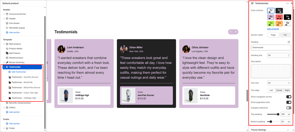
Configure container width, background colors, and section titles:
| Setting | Type | Default | Options / Range | Description |
|---|---|---|---|---|
| Color scheme | Color Scheme | scheme-1 | Theme Schemes | Controls section background, card colors, and the highlighted active center slide. |
| Section width | Select | Page-width | Page-width, Full-width | Controls horizontal margins across desktop displays. |
| Heading | Text | Testimonials | Free Text | The main title of your section (e.g., “VERIFIED COLLECTOR REVIEWS”). |
| Heading size | Select | H4 | H1 – H6 | Sets the typography scale of the section title. |
| Description | Textarea | Blank | Multiline Text | Supporting copy highlighting community satisfaction or delivery milestones. |
| Text size | Select | H5 | H1 – H6 | Sets the typography scale of the supporting description. |
| Text align | Select | Left | Left, Center, Right | Controls horizontal alignment of the header text and navigation buttons. |
| Top padding | Range Slider | 100px | 0px – 100px (step 1px) | Vertical spacing above the section. |
| Bottom padding | Range Slider | 100px | 0px – 200px (step 5px) | Vertical spacing below the section. |
Color Scheme & Dynamic Center-Card Pop #
In Sneax, the Testimonials carousel is built with centered slides (centeredSlides: true). As customer cards glide across the screen:
- Inactive review cards display with your theme’s highlight background and contrasting text.
- The active centered card automatically inverts its colors to a bold foreground background with vibrant accent typography, immediately drawing customer attention to the highlighted review.
2. Carousel & Navigation Controls #
Fine-tune how the review cards slide, paginate, and autoplay across different devices:
| Setting | Type | Default | Options / Range | Description |
|---|---|---|---|---|
| Show navigation | Checkbox | Enabled | Toggle | Displays previous and next circular arrow buttons in the header pill bar. |
| Show pagination | Checkbox | Enabled | Toggle | Renders a smooth horizontal progress bar fill showing the active scroll position. |
| Autoplay slideshow | Checkbox | Disabled | Toggle | Automatically advances through review slides every 3 seconds. |
Unified Header Navigation Pill Bar #
Sneax combines the horizontal Progress Bar and Prev/Next Navigation Buttons into a single cohesive pill-shaped container positioned opposite your section title, keeping the header clean and modern.
Autoplay with Smart Hover Pause #
When Autoplay slideshow is enabled, the carousel gently glides every 3 seconds. Sneax includes smart cursor detection that automatically pauses autoplay whenever a customer hovers or touches a card, giving them ample time to read the review or tap the linked sneaker.
Multi-Device Breakpoints #
- Desktop (
≥ 1024px): Displays 3 cards side-by-side with the center card active and highlighted. - Tablet (
768px–1023px): Displays 2 cards side-by-side. - Mobile Landscape (
450px–767px): Displays 2 compact cards. - Mobile Portrait (
< 450px): Displays 1 centered, full-width card for seamless mobile reading.
3. Content Blocks (Testimonial Cards) #
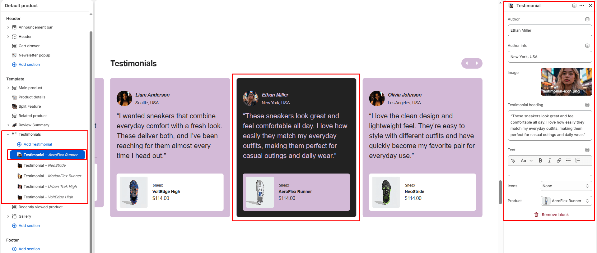
Add individual customer reviews by clicking (+) Add block > Testimonial under the section. Configure the following settings for each card:
| Setting | Type | Default | Description |
|---|---|---|---|
| Author | Text | Author name | The customer’s full name (displayed in bold, 16px). |
| Author info | Text | Author info | Supporting context (e.g., “Verified Buyer • London, UK”). |
| Image | Image Picker | Blank | Customer photo or avatar (rendered as a 50x50px circular avatar). |
| Icon | Select | 5-stars | Visual proof icon: 5-stars, 4-stars, 3-stars, 2-stars, 1-star, Quote, or None. |
| Testimonial title | Text | Testimonial title | Punchy review headline (rendered at 22px with a sleek underline border). |
| Testimonial | Richtext | Default text | Rich text editor for the full review body with bold, italic, and link support. |
| Product | Product Picker | Blank | Attach a specific product from your catalog to embed a shoppable product card. |
The Shoppable Product Attachment Feature #
When you select a product in the Product setting, Sneax embeds a compact, floating product card at the base of the review containing:
- The sneaker’s thumbnail photograph (with focal point support).
- The product vendor brand (e.g., “JORDAN” or “NIKE”).
- The official product title.
- Live price formatted to the customer’s selected currency (
{% render 'price' %}). - Clicking anywhere on the product card takes the customer straight to the product page to complete their purchase!
Star Ratings & Quote Icon Options #
The Icon dropdown lets you visually substantiate each review:
- 5-stars (
★★★★★): Displays golden star symbols (#FFCC00) at the top of the card. - Quote: Displays a clean modern typographic double-quote vector icon for editorial press quotes.
- None: Hides icons for a minimalist typographic presentation.
4. Spacing & Mobile Optimization #
- Desktop Spacing: Fully adjustable top padding (
0px–100px) and bottom padding (0px–200px). - Mobile Auto-Halving: On smartphone screens (
< 767px), Sneax automatically scales down top and bottom padding by 50% to preserve vertical screen space. - Compact Mobile Fonts: Review body text and titles smoothly adjust to smaller mobile line-heights, ensuring cards remain compact and readable on handheld screens.
Sneaker Store Best Practices #
- Always Attach a Product to Every Review:
- Don’t leave the Product field blank! Linking a pair of sneakers (e.g., Air Jordan 4 Retro or Yeezy Boost 350) creates an immediate buying path for customers who are inspired by that review.
- Highlight Authenticity & Sizing Feedback:
- Feature reviews that address top sneakerhead concerns: packaging condition during shipping, legit-check authenticity verifications, and exact half-size fit recommendations.
- Maintain at Least 5 Review Blocks for Seamless Looping:
- To ensure the Swiper carousel loops smoothly on wide desktop monitors without empty spaces, add at least 5 to 6 customer review blocks.