

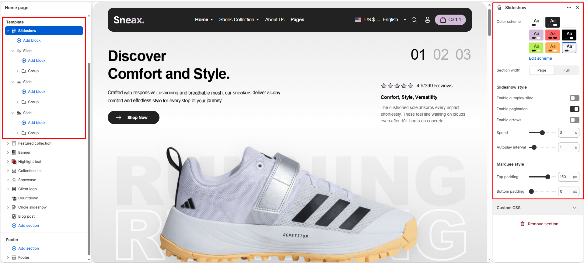
The Slideshow section serves as the ultimate hero merchandising canvas for your Sneax storefront. Engineered with smooth Swiper carousel mechanics and kinetic parallax transitions, it instantly captures shoppers’ attention the moment they land on your homepage.
Sneax takes hero banners to the next level by integrating an oversized typographic watermark running behind your featured footwear, alongside an optional customer rating and testimonial badge embedded directly inside each slide. Furthermore, utilizing Shopify OS 2.0 Nested Theme Blocks, merchants enjoy infinite design flexibility—enabling custom groupings of headings, subheadings, paragraphs, and multi-button call-to-actions on each slide individually.
Accessing the Slideshow Section Settings #
- From your Shopify Admin, navigate to Online Store > Themes.
- Click Customize next to your active Sneax theme.
- In the top dropdown template selector, select Home page.
- In the left-hand sidebar, click Slideshow (or click (+) Add section and select Slideshow).
- Click (+) Add block under the section to add individual Slide blocks. Under each slide, add a Group block to house headings, text, and buttons.
1. Global Carousel & Animation Settings #
Configure the container dimensions, automated rotation timings, and navigation controls across all slides:
| Setting | Type | Default | Options / Range | Description |
|---|---|---|---|---|
| Color scheme | Color Scheme | scheme-1 | Theme Schemes | Sets the master background and typography color contrast across the slideshow canvas. |
| Section width | Select | full-width | page-width, full-width | Choose between a boxed layout (page-width) or a full edge-to-edge canvas (full-width). Full-width is strongly recommended for hero slideshows. |
| Enable autoplay | Checkbox | false | Checked / Unchecked | Toggles automated slide cycling without requiring manual user interaction. |
| Show pagination | Checkbox | true | Checked / Unchecked | Displays oversized numerical slide indicators (e.g., “01”, “02”, “03”) anchored in the top-right corner. |
| Show navigation arrows | Checkbox | false | Checked / Unchecked | Displays circular previous and next navigation arrows in the bottom-right corner. |
| Transition speed | Range | 1.1s | 0s to 6s (step: 0.1s) | Controls the sliding animation duration when transitioning between slides. |
| Autoplay interval | Range | 3s | 0s to 8s (step: 0.1s) | Determines how long each slide remains static on screen before cycling to the next. |
2. Slide Block Configuration #
Each slide operates as a customizable container featuring independent background photography, giant watermark lettering, and customer review cards. Click on an individual Slide block to configure:
| Setting | Type | Default | Options / Range | Description |
|---|---|---|---|---|
| Desktop image | Image Picker | Blank | Image upload | Wide landscape lifestyle or footwear cutout photography optimized for desktop monitors (up to 1800px). |
| Mobile image | Image Picker | Blank | Image upload | Dedicated vertical portrait crop (750px) specifically tailored for smartphone screens. |
| Content position | Select | center | flex-start (Left), center (Center), flex-end (Right) | Aligns the overlaid text and button container horizontally across the slide. |
| Watermark text | Text Area | RUNNING | Multi-line text | Massive 17vw outline background lettering positioned behind the sneaker (e.g., “RETRO”, “AIR”, “COLLAB”). Second lines automatically render with a stylish stroke outline. |
| Rating score | Text | 4.9/399 | Text string | Numerical rating score displayed in the right-side review card (e.g., “4.9/5”). |
| Rating label | Text | Reviews | Text string | Accompanying text label placed beside the 5-star graphic. |
| Review title | Text | Comfort, Style, Versatility | Text string | Short praise headline summarizing collector sentiment. |
| Review description | Rich Text | <p>Every piece begins with...</p> | Rich text editor | Detailed customer testimonial or designer quote embedded in the slide’s lower right corner. |
3. Nested Content Architecture #
Under each Slide block, you can insert a Group block, which allows you to nest and reorder child content blocks freely:
- Subtitle Block: Displays a high-contrast category or release tag (e.g., “LIMITED EDITION DROP”, “SPRING 2026”).
- Heading (Title) Block: Displays your bold hero headline (e.g., “AIR JORDAN 4 ‘BRED'”). Offers font scale settings from
h1throughh6. - Text Block: Rich descriptive paragraph explaining the materials, heritage, or drop mechanics.
- Link (Button) Block: Primary call-to-action button (e.g., “Shop The Drop”, “Enter Raffle”). You can add multiple Button blocks side-by-side inside the same slide (e.g., “Shop Men” and “Shop Women”).
4. Spacing & Mobile Optimization #
Manage vertical layout padding:
| Setting | Type | Default | Options / Range | Description |
|---|---|---|---|---|
| Top padding | Range | 0px | 0px to 200px (step: 5px) | Vertical padding above the slideshow container. Set to 0px for a seamless header-to-hero transition. |
| Bottom padding | Range | 0px | 0px to 100px (step: 1px) | Vertical padding below the slideshow container. |
Responsive Behavior: On screens narrower than 767px, top and bottom padding values are automatically scaled to 75% of their desktop values. Background watermark text and floating review cards dynamically adjust their scale and layout to ensure unobstructed viewing on handheld devices.
Sneaker Store Best Practices #
- Always Upload Separate Mobile Images: Never rely on a single horizontal desktop banner for smartphones. Upload a dedicated 9:16 vertical crop in the Mobile image setting so your featured sneaker remains large, sharp, and centered without being awkwardly clipped on mobile viewports.
- Utilize the 17vw Watermark for Brand Identity: Enter iconic silhouette nicknames in the Watermark text setting (e.g., “JORDAN”, “DUNK LOW”, “YEEZY”). The massive semi-transparent lettering adds an unmistakable streetwear aesthetic that frames the shoe model perfectly.
- Deploy Twin Action Buttons for Gender Sizing: Add two Link blocks side-by-side inside your slide’s group container—one labeled “Shop Men’s Sizes” and the other “Shop Women’s Sizes”. This eliminates friction and routes sneakerheads straight to their relevant size charts in one click.