

The Contact Form section provides a direct, accessible line of communication between sneaker collectors and your store. In Sneax, this is designed as an editorial split-layout experience: one column houses the interactive submission form with validated name, email, phone number, and message fields, while the adjacent column showcases supplementary contact information blocks (such as your flagship sneaker boutique location, concierge telephone hotline, and operating hours).
When a customer submits an inquiry, Shopify automatically routes the message directly to the customer contact email address configured in your Shopify Admin > Settings > Store details.
Accessing the Contact Form Section Settings #
- From your Shopify Admin, navigate to Online Store > Themes.
- Click Customize next to your active Sneax theme.
- In the top dropdown template selector, switch to Pages > Contact (or add this section to any other page template).
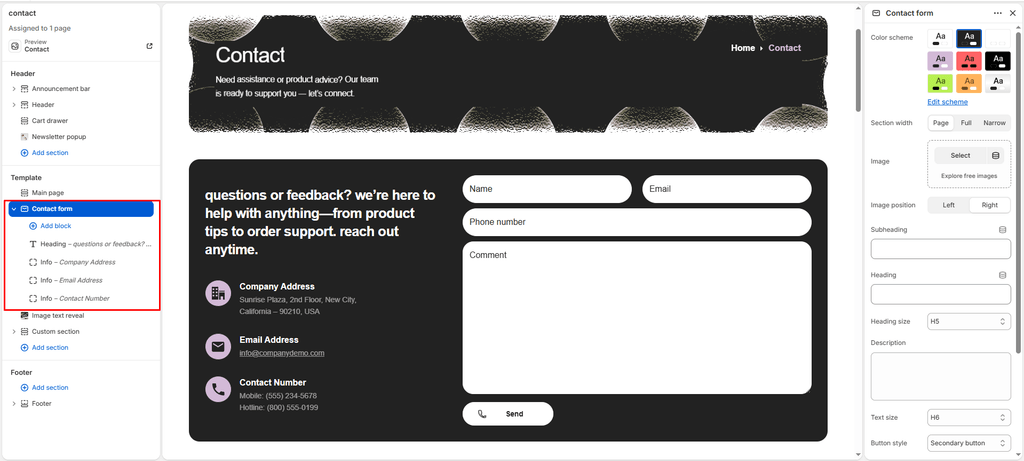
- In the left-hand sidebar, click on Contact form to customize layout and messaging.
- Click (+) Add block under the section to add contact info cards or heading blocks.
1. Section Layout & Heading Settings #
Configure container width, background color palettes, column orientation, and introductory copy:
| Setting | Type | Default | Options / Range | Description |
|---|---|---|---|---|
| Color scheme | Color Scheme | scheme-1 | Theme Schemes | Controls background fill and text contrast colors for the section container. |
| Section width | Select | narrow-width | page-width, full-width, narrow-width | Choose container dimensions. narrow-width centers the form for clean readability. |
| Image position | Select | left | left, right | Sets the orientation of the split layout (left places the form on the left; right places the form on the right). |
| Subheading | Text | Get in Touch | Text string | Small highlight kicker text positioned above the main title (e.g., “SNEAX CONCIERGE”). |
| Heading | Text | Let's chat. Reach out to us. | Text string | Primary title for the inquiry section (e.g., “CUSTOMER CARE & AUTHENTICITY”). |
| Heading size | Select | h5 | h1 to h6 | Sets the visual typography scale and font hierarchy of the section heading. |
| Description | Text Area | Have questions or feedback?... | Multi-line text | Reassuring supporting copy explaining response turnaround times. |
| Text size | Select | h5 | h1 to h6 | Sets the font size of the descriptive text paragraph. |
2. Submit Button & Icon Configuration #
Customize the form’s primary action trigger:
| Setting | Type | Default | Options / Range | Description |
|---|---|---|---|---|
| Button style | Select | button-primary | button-primary, button-secondary, button-link | Controls the button visual appearance (solid primary, outlined secondary, or minimalist text link). |
| Button icon | Select | phone | cart, quickview, location, phone, arrow, email, account, search, heart | Displays a clean vector icon alongside the submit button text. |
3. Contact Info Content Blocks #
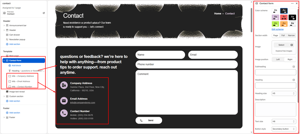
In the adjacent column, you can display structured contact channels using two specialized block types:
Heading Block #
Displays a secondary column title:
| Setting | Type | Default | Options / Range | Description |
|---|---|---|---|---|
| Heading | Text Area | Let’s Connect | Text string | Title text for the contact information column. |
| Heading size | Select | h4 | h1 to h6 | Sets the font size for the column heading. |
Info Block #
Displays an individual contact channel card featuring a custom icon or image, heading, and rich text:
| Setting | Type | Default | Options / Range | Description |
|---|---|---|---|---|
| Icon | Select | none | Vector Icon Library | Select from vector icons: none, picto-avatar, picto-chat, picto-comment, picto-customer-support, picto-envelope, picto-mobile-phone, picto-operator, picto-phone, picto-send, picto-user, picto-email, picto-pin. |
| Icon image | Image Picker | Blank | Image upload | Upload a custom PNG/SVG brand badge or icon to override the vector dropdown. |
| Heading | Text | Heading | Text string | Card title (e.g., “Flagship Store”, “VIP Hotline”, “Email Support”). |
| Text | Rich Text | Blank | Rich text editor | Detailed information such as street address, operating hours, telephone numbers, or support email links. |
4. Section Spacing & Mobile Optimization #
Manage vertical layout breathing room:
| Setting | Type | Default | Options / Range | Description |
|---|---|---|---|---|
| Top padding | Range | 0px | 0px to 200px (step: 5px) | Vertical padding above the contact form container on desktop monitors. |
| Bottom padding | Range | 0px | 0px to 100px (step: 1px) | Vertical padding below the contact form container on desktop monitors. |
Responsive Behavior: On screens narrower than 767px, top and bottom padding values are automatically scaled down by 50%. The two-column split layout stacks into a single mobile column, and input fields adapt to 100% width for effortless mobile keyboard typing.