

The Main Collection section powers the core browsing and purchasing experience of your collection pages (such as Running Shoes, Basketball Sneakers, New Drops, or Clearance Footwear).
Sneax equips your catalog with advanced faceted filtering, multiple pagination modes (Infinite Scroll, Load More, or Standard Numbers), interactive footwear card previews, and In-Grid Promotional Banners with Live Countdown Timers.
How to Access Main Collection Settings #
- From your Shopify Admin, navigate to Online Store > Themes.
- Click Customize on the Sneax theme.
- In the top template selector, navigate to Collections > Default collection.
- In the left sidebar under the Template group, click the Product grid (Main collection) section.
- Configure your grid density, filtering style, and product card options.
- Click Save.
Layout & Grid Density Settings #
| Setting Name | Type | Options / Range | Default | Description |
|---|---|---|---|---|
| Color scheme | Color Scheme Picker | Any configured color scheme | Scheme 8 | Controls the background, typography, and card container styling for the entire collection grid. |
| Section width | Dropdown | Page width, Full width | Page width | Determines whether the collection grid aligns with your site container or stretches edge-to-edge. |
| Products per page | Slider / Range | 1 – 100 (Step: 1) | 14 | The total number of footwear items loaded initially on the page. |
| Desktop columns | Slider / Range | 1 – 6 (Step: 1) | 4 | Number of sneaker cards displayed per row on desktop monitors and laptops. |
| Mobile columns | Slider / Range | 1 – 3 (Step: 1) | 2 | Number of sneaker cards displayed per row on mobile phones and tablets. |
| Top padding | Slider / Range | 0px – 200px (Step: 5px) | 50px | Top whitespace spacing above the filter bar and grid. |
| Bottom padding | Slider / Range | 0px – 100px (Step: 1px) | 40px | Bottom whitespace spacing below the pagination. |
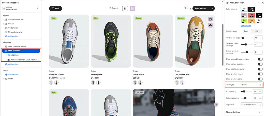
Faceted Filtering & Sorting (filter_type)
Sneax allows you to present Shopify Search & Discovery filters (such as Shoe Size, Colorway, Price, Brand, Activity) in three distinct formats:
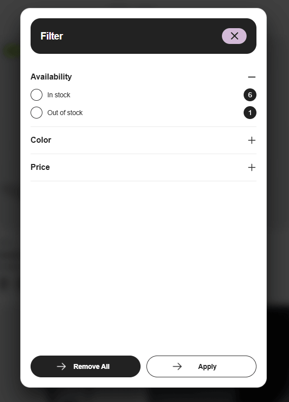
- Drawer (Default): Keeps the footwear grid completely clean and distraction-free. Shoppers click an animated “Filter” button to slide open a dedicated filter drawer from the side.
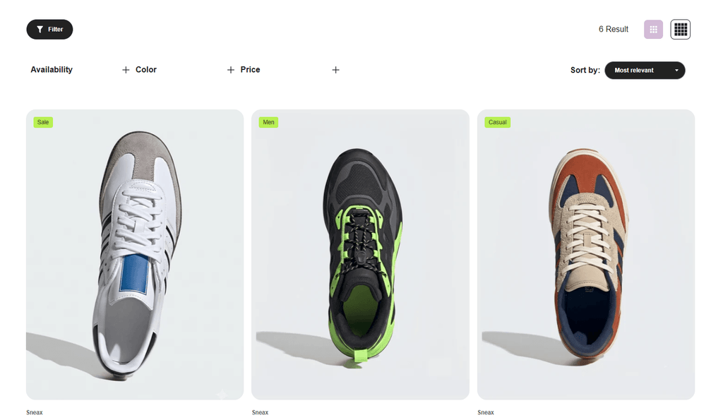
- Horizontal : A sleek, modern filter bar spanning across the top of the grid with dropdown menus for each filter group.
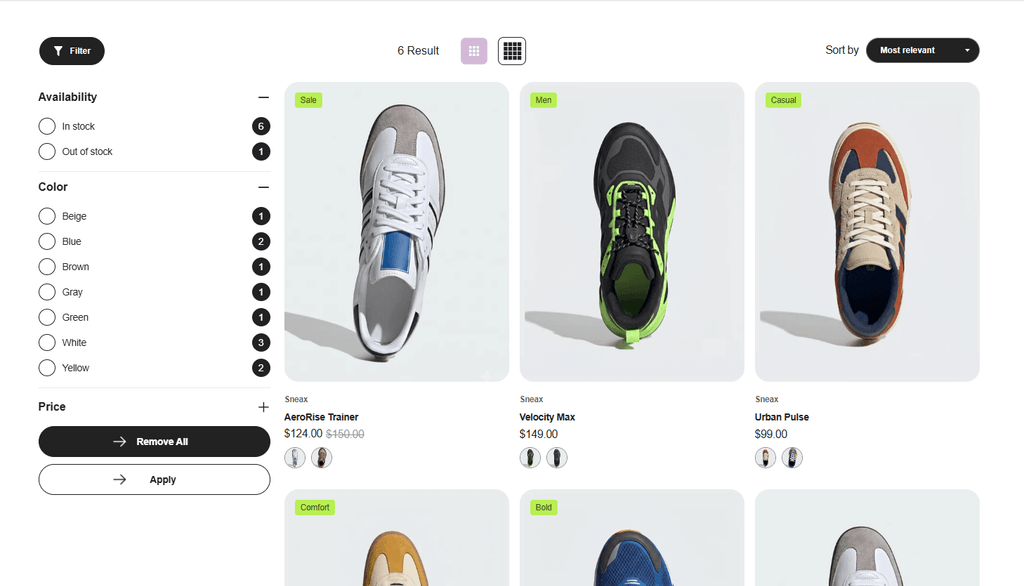
- Vertical: Traditional e-commerce layout featuring a permanent sidebar on the left side of the product grid.
Pagination Engine (pagination_type) #
Choose how customers navigate through large footwear inventories:
- Infinite Scroll (
infinite): As shoppers scroll down the page, new sneaker cards load automatically and seamlessly into the grid without requiring any clicks. - Load More Button (
load_more): Displays a stylish AJAX button at the bottom of the grid. Clicking it appends the next batch of sneakers instantly. - Numbered Pagination (
number): Traditional numbered pagination links (1, 2, 3... Next) for structured, multi-page browsing.
Footwear Card Merchandising Toggles #
Customize what interactive elements appear on individual product tiles:
| Setting Name | Type | Default | Description |
|---|---|---|---|
| Show secondary image on hover | Checkbox | Enabled (true) | Hovering over a card instantly reveals a second photo (ideal for showcasing the shoe sole, heel profile, or on-foot lifestyle angle). |
| Show variant swatches | Checkbox | Enabled (true) | Displays interactive colorway swatches directly on the card so shoppers can preview alternate shoe colors without opening the product page. |
| Show ‘Add to cart’ | Checkbox | Enabled (true) | Embeds a quick action button on the card, enabling fast size selection and cart addition directly from the grid. |
| Show vendor | Checkbox | Enabled (true) | Displays the shoe brand or designer name above the product title. |
| Show rating | Checkbox | Enabled (true) | Displays star ratings and review counts from your installed Shopify review app. |
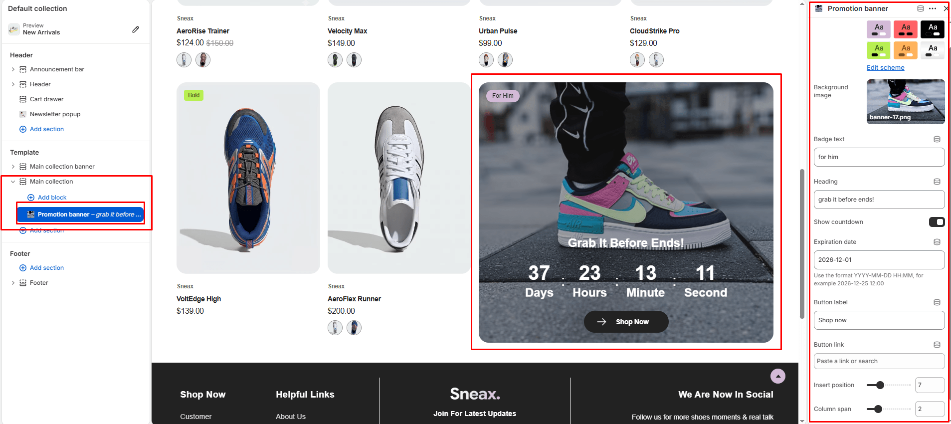
In-Grid Promotional Banners (promotion_banner Block) #
Sneax lets you inject high-impact promotional billboard cards directly into the flow of your sneaker catalog:
- In the Theme Editor under the Product grid section, click Add Promotion banner.
- Configure the block settings:
- Background image: Upload a campaign photo or graphic for the promo card.
- Badge text: Enter a highlight badge (e.g., “FLASH DROP”, “MEMBERS ONLY”, “SALE”).
- Title: Bold headline (default: “GRAB IT BEFORE ENDS!”).
- Show countdown & Expiration date: Toggle on a real-time countdown timer and enter your target deadline (format:
YYYY-MM-DD HH:MM:SS) to create urgency for limited drops. - Button label & Link: Custom CTA button (e.g., “Shop Exclusive Drop”).
- Insert position (
1to24): Controls exactly after which product the banner appears (e.g., setting to3injects it right after the 3rd sneaker card). - Column span (
1to6): Controls how wide the banner stretches across the grid (e.g.,2columns wide).
Pro Tips for Sneax Footwear Stores #
- Optimal Desktop Density: Setting Desktop columns to
4with a2-column Promotion banner injected at position3creates an editorial, high-end look where sneakers and campaign banners balance each other naturally. - Infinite Scroll for Sneaker Drops: For large collections with 50+ pairs, enable Infinite pagination. Sneakerheads love endless scrolling through silhouettes on mobile devices.