

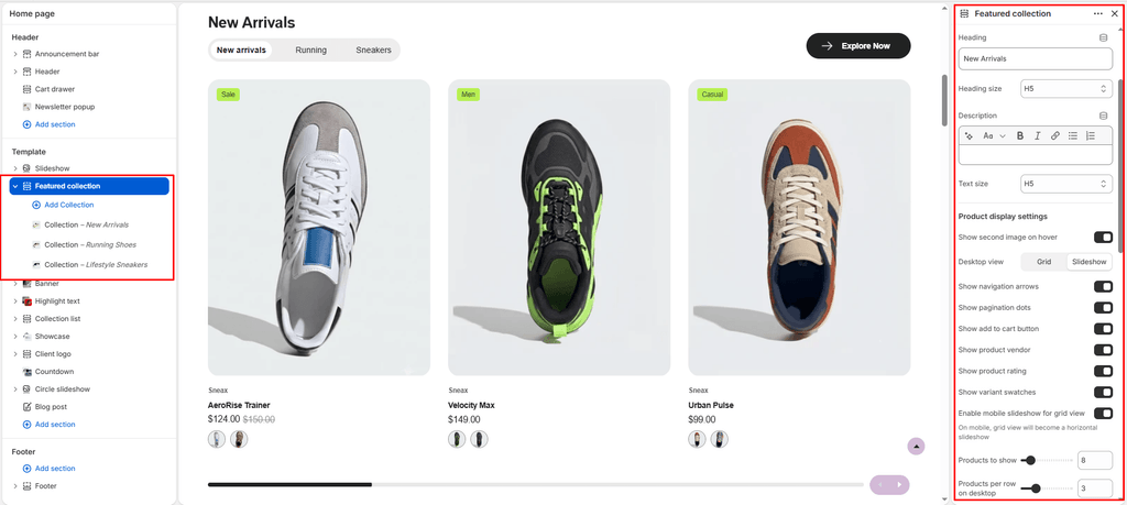
- Accessing the Featured Collection Section Settings
- 1. General Layout & Header Typography
- 2. Product Grid & Slideshow Display Controls
- 3. Product Card Feature Toggles
- 4. "View All" Collection Call-To-Action
- 5. In-Grid Promotional Banner (Campaign Feature)
- 6. Content Blocks: Collection Tabs
- 7. Spacing & Mobile Optimization
- Sneaker Store Best Practices
The Featured Collection section in Sneax serves as your storefront’s primary merchandising engine. Engineered specifically for high-velocity sneaker drops, apparel releases, and curated brand catalogs, it supports an interactive Multi-Tab Architecture. Instead of forcing customers to navigate through multiple pages or stacking separate collection sections, shoppers can effortlessly switch between categories (e.g., “Air Jordan”, “Yeezy”, “Latest Drops”, “Streetwear”) with instant tab switching.
The section provides full flexibility between an interactive, touch-swipeable Slideshow (Carousel) and an expansive CSS Grid. It also includes built-in merchandising powerhouses such as an in-grid Promotional Editorial Banner, interactive color/material swatches, quick add-to-cart triggers, secondary image hover effects, and responsive “View All” call-to-actions.
Accessing the Featured Collection Section Settings #
- From your Shopify Admin, navigate to Online Store > Themes.
- Click Customize next to your active Sneax theme.
- In the top dropdown template selector, choose Home page (or any other page template).
- In the left-hand sidebar, click on Featured collection (or click (+) Add section and select Featured collection).
- Click (+) Add block under the section to add or organize your Collection tab blocks.
1. General Layout & Header Typography #
Configure the container dimensions, color theme scheme, section headings, and descriptive text:
| Setting | Type | Default | Options / Range | Description |
|---|---|---|---|---|
| Color scheme | Color Scheme | scheme-1 | Theme Schemes | Controls the master background, text, and card surface colors for the section. |
| Section width | Select | page-width | page-width, full-width | Choose between a bounded container (page-width) or an edge-to-edge full screen experience (full-width). |
| Heading | Text | Featured collection title | Text string | Main title displayed prominently above the product grid/slider (e.g., “HOTTEST SNEAKER DROPS”). |
| Heading size | Select | h4 | h1 to h6 | Sets the visual scale and hierarchy of the section heading. |
| Description | Rich Text | Blank | Rich text editor | Optional supporting copy or release schedule summary displayed beneath the heading. |
| Text size | Select | h5 | h1 to h6 | Controls font sizing for the descriptive text. |
2. Product Grid & Slideshow Display Controls #
Customize how your footwear products are arranged, whether in a high-density grid or an interactive touch-swipeable carousel:
| Setting | Type | Default | Options / Range | Description |
|---|---|---|---|---|
| Desktop view | Select | slideshow | grid, slideshow | Select slideshow for a smooth Swiper carousel with navigation arrows, or grid for an expansive multi-row layout. |
| Show navigation arrows | Checkbox | true | Checked / Unchecked | Toggles next/previous circular arrow buttons for desktop slideshow navigation. |
| Show pagination | Checkbox | true | Checked / Unchecked | Toggles the bottom progress/pagination indicators in slideshow mode. |
| Products to show | Range | 8 | 2 to 50 (step: 1) | The maximum number of sneaker cards loaded and displayed per collection tab. |
| Products per row on desktop | Range | 4 | 2 to 6 (step: 1) | Determines how many product cards appear across a single row on desktop monitors. |
| Products per row on mobile | Range | 2 | 1 to 3 (step: 1) | Sets the column count on mobile screens (2 columns is recommended for sneakers). |
| Enable mobile slideshow for grid | Checkbox | true | Checked / Unchecked | When grid view is active, checking this automatically converts the mobile layout into a horizontal swipeable track, preventing endless vertical scrolling. |
3. Product Card Feature Toggles #
Control the rich interactive features displayed directly on every footwear card within the collection:
| Setting | Type | Default | Options / Range | Description |
|---|---|---|---|---|
| Show secondary image on hover | Checkbox | false | Checked / Unchecked | Reveals the second gallery image on mouse hover (ideal for showing on-foot lifestyle shots or shoe soles). |
| Show add to cart button | Checkbox | true | Checked / Unchecked | Displays a fast-action quick add or size-selection button directly over the product card. |
| Show product vendor | Checkbox | true | Checked / Unchecked | Displays the brand name (e.g., Nike, Jordan, adidas, New Balance) above the product title. |
| Show product rating | Checkbox | true | Checked / Unchecked | Renders review star ratings directly on the card to reinforce social proof. |
| Show variant swatches | Checkbox | true | Checked / Unchecked | Displays color and material swatches directly on the card for quick variant previewing. |
4. “View All” Collection Call-To-Action #
Guide shoppers deeper into your full product catalog with responsive, dual-positioned collection link buttons:
| Setting | Type | Default | Options / Range | Description |
|---|---|---|---|---|
| Enable “View all” button | Checkbox | true | Checked / Unchecked | Enables the collection link button. Appears in the top-right header on desktop, and moves to the section bottom on mobile. |
| Button label | Text | Button label | Text string | The text displayed inside the button (e.g., “Explore All Jordans”, “View Full Collection”). |
| Button style | Select | button-primary | button-primary, button-secondary, button-link | Applies solid primary, bordered secondary, or minimalist underline link button aesthetics. |
| Button icon | Select | cart | cart, quickview, location, phone, arrow, email, account, search, heart | Displays a clean vector icon alongside your button text (e.g., select arrow for navigation). |
5. In-Grid Promotional Banner (Campaign Feature) #
Insert a high-impact editorial card as the very first slide in your product carousel to highlight seasonal campaigns, discount codes, or collaboration lookbooks:
| Setting | Type | Default | Options / Range | Description |
|---|---|---|---|---|
| Show promo banner | Checkbox | false | Checked / Unchecked | Enables an editorial marketing banner slide embedded directly inside the product carousel. |
| Promo banner image | Image Picker | Blank | Image upload | Lifestyle sneaker campaign image or graphic visual for the banner. |
| Promo banner heading | Text | Special Offer | Text string | Bold editorial title displayed over the banner (e.g., “WEEKEND HEAT DROP”). |
| Promo banner text | Text Area | Blank | Multi-line text | Subtitle, promo code information, or drop date details. |
| Show promo banner button | Checkbox | true | Checked / Unchecked | Toggles the actionable call-to-action button on the banner card. |
| Button label | Text | Shop now | Text string | Button copy on the promo banner card (e.g., “Claim 20% Off”). |
| Button link | URL | Blank | Page / Collection URL | Destination web link for the banner card and button. |
6. Content Blocks: Collection Tabs #
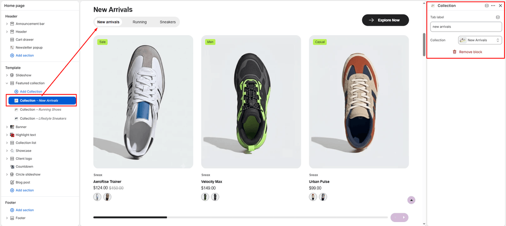
The tab navigation system allows you to organize multiple collections into a single organized section. When multiple tabs are added, Sneax renders sleek, pill-shaped tab buttons above the product showcase:
| Block Type | Setting | Type | Default | Description |
|---|---|---|---|---|
| Collection tab | Tab label | Text | Blank | Custom text for the tab button (e.g., “Air Jordan”, “Dunks”, “New Arrivals”). If left blank, it automatically uses the collection’s official title. |
| Collection tab | Collection | Collection Picker | Blank | Selects the Shopify collection whose products will load under this tab. |
Note: Adding a single block displays that collection without tabs. Adding 2 or more blocks automatically generates the interactive tab navigation bar.
7. Spacing & Mobile Optimization #
Fine-tune vertical spacing to ensure balanced layouts across all screen resolutions:
| Setting | Type | Default | Options / Range | Description |
|---|---|---|---|---|
| Top padding | Range | 100px | 0px to 200px (step: 5px) | Vertical breathing room above the section header on desktop screens. |
| Bottom padding | Range | 100px | 0px to 100px (step: 1px) | Vertical breathing room below the product grid on desktop screens. |
Responsive Behavior: On mobile devices with screen widths below 767px, top and bottom padding values are automatically scaled down by 50% to maintain compact spacing and prevent excessive scrolling.
Sneaker Store Best Practices #
- Curate by Hype & Silhouette Using Tabs: Group footwear logically using 3 to 4 tabs max (e.g., Air Jordan 1, Dunk Low, Travis Scott Collabs, Apparel). This lets sneaker collectors find their exact silhouette without cluttering your homepage.
- Leverage the Promo Banner for High-Heat Drops: Enable the Promo Banner inside your main slideshow tab. Use an authentic on-foot lifestyle photo with a title like “SNKRS Member Early Access” to push app signups or VIP loyalty access right beside the buyable pairs.
- Keep Mobile Grid Slideshow Enabled: With 8 to 12 products per collection, vertical grids force mobile users into lengthy scrolling. Enabling
mobile_slideshow_for_gridpreserves your homepage hierarchy by converting the feed into a snappy, thumb-friendly horizontal slider.