

The Split Feature section is an editorial, cinematic storytelling component in the Sneax theme. Built on a balanced 50/50 split architecture, it pairs an interactive, scroll-pinned dual-layer visual presentation on one side with an editorial narrative, brand emblem, and animated call-to-action button on the other.
Accessing the Split Feature Section Settings #
- Open your Shopify Admin and navigate to Online Store > Themes.
- Click Customize next to your active Sneax theme.
- Select the template where you want this section to appear (e.g., Home page, About us, or a Collab Story landing page).
- In the left-hand sidebar, click Add section and select Split feature (or click on an existing Split feature section).
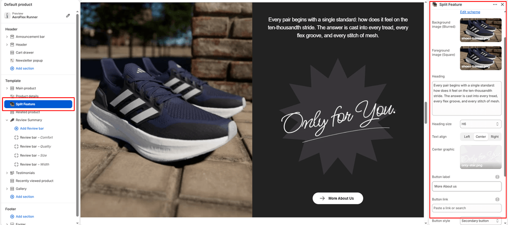
- The right sidebar will display all dual-layer imagery, typography, center graphic, and button settings.
1. General & Visual Style #
Set the color scheme and atmosphere for the section container.
| Setting | Type | Default | Options / Range | Description |
|---|---|---|---|---|
| Color scheme | Color Scheme | scheme-3 | Theme Color Schemes | Sets the background and text color palette for the entire split feature container. |
2. Dual-Layer Media & Pinned Scroll Zoom Settings #
The left column features a layered media composition powered by GSAP ScrollTrigger animation.
| Setting | Type | Default | Options / Range | Description |
|---|---|---|---|---|
| Background image | Image Picker | None | Image file (.png, .webp, .jpg) | The backdrop image filling the left half. Sneax automatically applies an ambient 8px Gaussian blur and subtle 1.1x scale to create a soft, atmospheric foundation. |
| Foreground image | Image Picker | None | Image file (.png, .webp, .jpg) | The high-definition hero visual placed in the floating foreground card. Rendered with an illuminated border and shadow. |
How the Scroll-Pinned Zoom Animation Operates #
- Entrance State: When the section scrolls into the viewport center, the section automatically pins in place. The foreground card begins as a neat floating square with rounded corners, a luminous border , and elevation drop shadow.
- Scroll Transition (Scrub): As the customer continues scrolling downward through the pinned duration, the foreground card seamlessly expands to 100% width and 100% height, while its border and shadow smoothly dissolve away into full bleed.
- Mobile Optimization: On mobile viewports (
< 768px), pinning triggers attop topwith initial dimensions scaling responsively between 180px and 320px for flawless handheld performance.
3. Editorial Story & Typography Settings #
The right column features editorial storytelling designed to communicate brand philosophy, shoe design ethics, or material craftsmanship.
| Setting | Type | Default | Options / Range | Description |
|---|---|---|---|---|
| Heading | Textarea | Every pair begins with a single question: how will this feel on the hundredth wear. The answer is built into every sole, every seam, every choice of material. | Multiline text | Editorial brand manifesto or narrative paragraph. Supports <br> tags for intentional editorial line breaks. Includes subtle scroll-based typography animation. |
| Heading size | Select | h6 | h1, h2, h3, h4, h5, h6 | Determines the typographic scale of the narrative text. |
| Text alignment | Select | Left | Left, Center, Right | Controls horizontal text alignment within the right content column. |
4. Center Brand Graphic & Accent Visual #
Add a signature brand stamp, collab emblem, sole blueprint, or graphic logo badge centered beneath the narrative.
| Setting | Type | Default | Options / Range | Description |
|---|---|---|---|---|
| Center graphic | Image Picker | None | Image file (.png, .webp, .svg) | Graphic visual rendered in the middle of the right-hand column (up to 450px wide). Ideal for brand monograms, tech icons (e.g., carbon-fiber plate icon, Gore-Tex logo), or signature collab insignias. |
5. Call-to-Action Button & Icon Customization #
Guide shoppers to your brand story, sustainability page, or featured footwear collection.
| Setting | Type | Default | Options / Range | Description |
|---|---|---|---|---|
| Button label | Text | More About us | Text input | The button text displayed. Leave blank to hide the button entirely. |
| Button link | URL | None | Page / Collection / Product / Custom URL | Destination link when clicked. |
| Button style | Select | Button primary | Button primary, Button secondary, Button link | Visual button styling based on global theme button definitions. |
| Button icon | Select | Arrow | Cart, Quickview, Location, Phone, Arrow, Email, Account, Search, Heart | Vector icon placed alongside the button text inside an animated interactive wrapper. |
Spacing & Mobile Optimization #
Manage vertical distance around the section.
| Setting | Type | Default | Options / Range | Description |
|---|---|---|---|---|
| Top padding | Range | 0px | 0px to 200px (step: 5px) | Desktop vertical padding above the section. Automatically halved on screens under 768px. |
| Bottom padding | Range | 0px | 0px to 100px (step: 1px) | Desktop vertical padding below the section. Automatically halved on screens under 768px. |
Sneaker Store Best Practices #
- Layer Macro Details Over Lifestyle Backdrops: For maximum visual impact, set Background image to an on-foot street photography shot and Foreground image to an ultra-sharp, isolated macro photo of the sneaker’s outsole traction pattern, foam cushioning, or raw suede stitching. When the card expands on scroll, it creates a dramatic reveal of your shoe’s craftsmanship.
- Feature Authentic Tech Badges: Use the Center graphic slot to show off technical sneaker certifications—such as waterproof membrane icons, Vibram sole badges, orthotic insoles, or collaborative sneaker artist signatures.
- Complementary Color Scheme: Select a contrasting color scheme (such as dark
scheme-3orscheme-4) to make the pinned photo expansion feel like a premium art installation within your store’s flow.