

The Shop the Look section is one of the most engaging, high-converting visual merchandising tools in the Sneax theme. Designed to bridge the gap between aspirational streetwear lookbooks and instant checkout, it allows merchants to showcase side-by-side editorial lifestyle shots tagged with interactive, pulsing “+” hotspot pins.
When customers click or tap a pin, an animated popup card appears featuring the exact sneaker, hoodie, or accessory tagged in that photo, complete with a product thumbnail, title, and live price. With separate coordinates for desktop and mobile screens, hotspot pins maintain pixel-perfect positioning across all device aspect ratios.
Accessing the Shop the Look Section Settings #
- From your Shopify Admin, navigate to Online Store > Themes.
- Click Customize next to your active Sneax theme.
- In the top dropdown template selector, select Home page (or any custom landing page).
- In the left-hand sidebar, click (+) Add section and select Shop the look.
- Expand the section in the sidebar to configure the master section settings, add Look image blocks (up to 2), and add Product hotspot blocks.
1. Section Header & Grid Layout Settings #
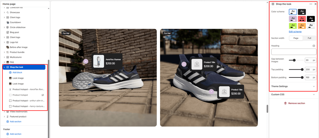
Configure container width, background color palette, and column spacing between the two editorial images:
| Setting | Type | Default | Options / Range | Description |
|---|---|---|---|---|
| Color scheme | Color Scheme | scheme-1 | Theme Schemes | Dictates the section’s master background and text color scheme. |
| Section width | Select | page-width | page-width, full-width | Choose between a centered bounded container (page-width) or an edge-to-edge canvas (full-width). |
| Heading | Text | Blank | Text string | Optional title displayed above the lookbook gallery (e.g., “STREETWEAR FIT CHECK”, “SHOP THE ON-FOOT LOOK”). |
| Column gap | Range | 16px | 0px to 60px (step: 2px) | Controls the horizontal gap between the two side-by-side images. Set to 0px for a seamless edge-to-edge split-screen aesthetic. |
2. Look Blocks #
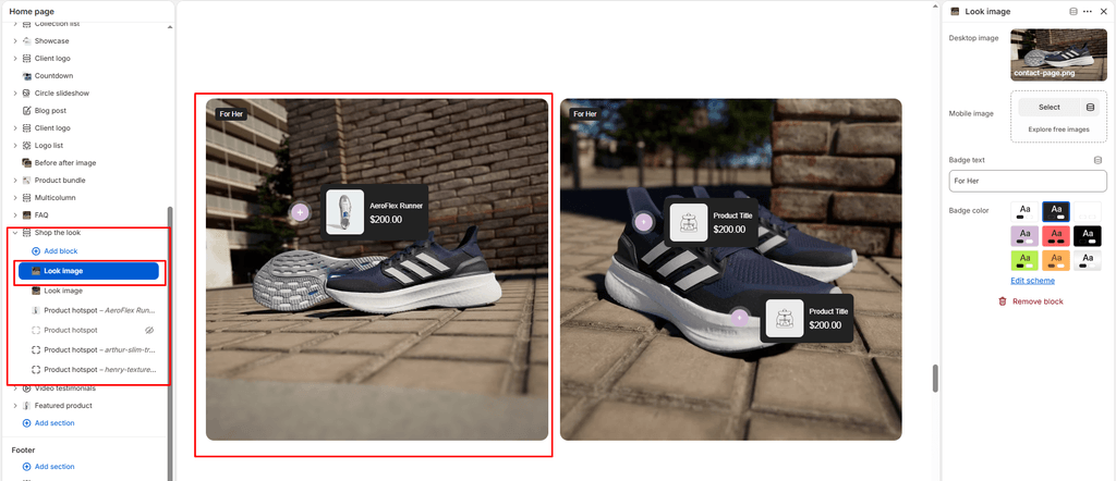
The section supports a maximum of 2 Look blocks arranged side-by-side (50% width each on desktop, stacked on mobile). Click (+) Add block > Look to add an editorial image container:
| Setting | Type | Default | Options / Range | Description |
|---|---|---|---|---|
| Desktop image | Image Picker | Blank | Image upload | The primary high-resolution photography displayed on desktop and tablet viewports. |
| Mobile image | Image Picker | Blank | Image upload | An optional vertical portrait crop optimized specifically for mobile phone screens. If left empty, the desktop image is used. |
| Badge text | Text | For Her | Text string | Floating text badge anchored in the top-left corner of the image (e.g., “For Him”, “For Her”, “Drop 01”, “Winter Collection”). |
| Badge color scheme | Color Scheme | scheme-2 | Theme Schemes | Controls the accent background and text contrast of the floating corner badge. |
3. Product Hotspot Blocks #
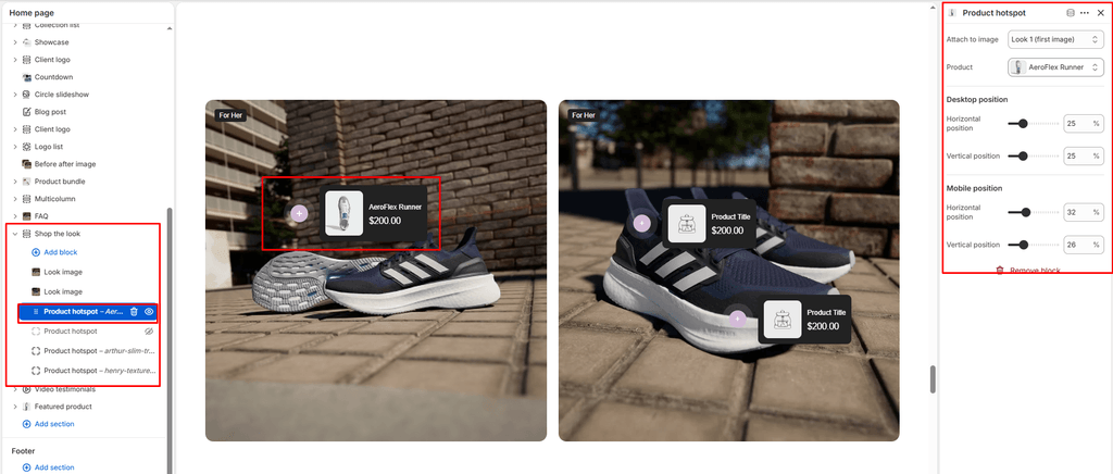
Tag individual clothing items, sneakers, or caps directly on your lifestyle images. Click (+) Add block > Product hotspot:
| Setting | Type | Default | Options / Range | Description |
|---|---|---|---|---|
| Look | Select | 1 | 1 (Left Image), 2 (Right Image) | Selects which of the two look images this hotspot pin belongs to. |
| Product | Product Picker | Blank | Store product catalog | Select the exact sneaker or streetwear item tagged at this point on the model. Sneax renders an instant popup with its thumbnail, title, and price. |
| Desktop horizontal position | Range | 50% | 0% to 100% (step: 1%) | Sets the horizontal coordinate of the pin from left (0%) to right (100%) on desktop screens. |
| Desktop vertical position | Range | 50% | 0% to 100% (step: 1%) | Sets the vertical coordinate of the pin from top (0%) to bottom (100%) on desktop screens. |
| Mobile horizontal position | Range | 50% | 0% to 100% (step: 1%) | Sets the horizontal coordinate of the pin on mobile screens to match the mobile image crop. |
| Mobile vertical position | Range | 50% | 0% to 100% (step: 1%) | Sets the vertical coordinate of the pin on mobile screens to match the mobile image crop. |
Pin Interaction: The hotspot features a continuous pulsing radar ring animation. Clicking the pin rotates the “+” icon into an “x” close button and reveals the product card.
4. Spacing & Mobile Optimization #
Manage vertical layout breathing room across all screen sizes:
| Setting | Type | Default | Options / Range | Description |
|---|---|---|---|---|
| Top padding | Range | 60px | 0px to 200px (step: 5px) | Vertical padding above the section on desktop screens. |
| Bottom padding | Range | 60px | 0px to 100px (step: 1px) | Vertical padding below the section on desktop screens. |
Responsive Behavior: On screens narrower than 767px, top padding, bottom padding, and the column gap are automatically scaled down by 50% to maintain a compact, mobile-friendly layout. Look images stack vertically on mobile, and the theme switches to using the mobile_horizontal and mobile_vertical pin coordinates.
Sneaker Store Best Practices #
- Curate “Head-to-Toe” Outfit Bundles: Sneakerheads don’t just buy shoes; they buy into the full lifestyle aesthetic. Feature a full-body model shot and tag three distinct hotspots: one on the fitted cap/beanie, one on the oversized streetwear hoodie, and one directly on the retro sneakers.
- Fine-Tune Desktop vs. Mobile Coordinates: Because desktop images are wide landscape or square and mobile displays are vertical portrait, clothing positions shift relative to the container frame. Always test both viewports in the Theme Editor and adjust the Mobile horizontal and Mobile vertical sliders so the pin rests directly on the footwear.
- Use the “0px Gap” for Split-Gender Lookbooks: Set the Column gap slider to
0pxand upload a “His & Hers” street styling photo pair. Use the badge text settings (“FOR HIM” and “FOR HER”) with high-contrast color schemes to create an editorial, magazine-style split showcase.