

The Banner section in Sneax serves as a static, high-impact hero showcase designed to command immediate attention. Whether spotlighting an exclusive brand collaboration (e.g., Nike x Off-White), launching a seasonal sneaker drop, or directing shoppers into flagship category collections, this section delivers an editorial magazine-cover aesthetic.
Built with performance and responsiveness at its core, the section provides dedicated image upload slots for both desktop and mobile viewports.
Accessing the Banner Section Settings #
- From your Shopify Admin, navigate to Online Store > Themes.
- Click Customize next to your active Sneax theme.
- In the top dropdown template selector, select Home page (or any collection / landing page).
- In the left-hand sidebar, click (+) Add section and select Banner.
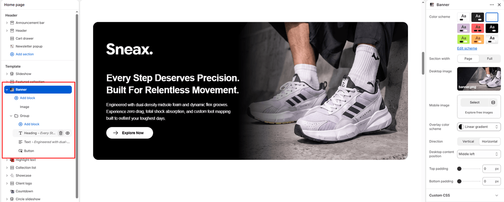
- Click directly on Banner to configure layout and positioning, and click (+) Add block under the section to insert child blocks (such as headings, text, countdowns, and buttons).
1. Section Layout & Color Scheme Settings #
Configure the container boundaries and background overlay styling:
| Setting | Type | Default | Options / Range | Description |
|---|---|---|---|---|
| Color scheme | Color Scheme | scheme-1 | Theme Schemes | Controls the master background fill and text contrast colors for the section canvas. |
| Section width | Select | page-width | page-width, full-width | Choose between a centered bounded container (page-width) or an edge-to-edge full width canvas (full-width). |
| Overlay color background | Background Color | scheme-1 | Solid color or Gradient | Sets the background fill or tint applied behind the nested content card for enhanced legibility. |
2. Responsive Hero Media Configuration #
Upload separate photography optimized for horizontal widescreen displays and vertical smartphones:
| Setting | Type | Default | Options / Range | Description |
|---|---|---|---|---|
| Desktop image | Image Picker | Blank | Image upload | High-resolution horizontal landscape banner photography (supports widths up to 2000px). Includes focal point positioning and automatic eager-loading if placed at the top of the page. |
| Mobile image | Image Picker | Blank | Image upload | Dedicated vertical portrait photo displayed exclusively on screens narrower than 767px (with an automatic 600px minimum height). If left blank, the desktop image is used. |
3. Overlay Positioning & Alignment Matrix #
Position your text and action buttons precisely over the banner image:
| Setting | Type | Default | Options / Range | Description |
|---|---|---|---|---|
| Content direction | Select | horizontal | vertical, horizontal | Controls the internal flex alignment flow of the overlay container. |
| Desktop content position | Select | middle-center | 9-Point Grid | Positions the content card over the image: top-left, top-center, top-right, middle-left, middle-center, middle-right, bottom-left, bottom-center, or bottom-right. |
4. Nested Content Blocks Architecture #
The Banner section utilizes Shopify OS 2.0 Theme Blocks. You can nest and reorder any combination of blocks within the overlay card:
- Subtitle Block: Small uppercase kicker text (e.g., “RETRO BASKETBALL CAPSULE”).
- Heading (Title) Block: Bold hero title with selectable font sizes from
h1throughh6(e.g., “THE CLASSIC DUNK LOW”). - Text Block: Rich descriptive paragraph explaining the silhouette materials, story, or drop details.
- Link (Button) Block: Actionable button with customizable styles (Primary, Secondary, Link) and vector icons. Multiple buttons can be added side-by-side.
- Countdown Block: Embeds a live countdown timer ticking down to your upcoming sneaker drop date.
5. Spacing & Mobile Optimization #
Fine-tune vertical breathing room above and below the banner:
| Setting | Type | Default | Options / Range | Description |
|---|---|---|---|---|
| Top padding | Range | 0px | 0px to 200px (step: 5px) | Vertical padding above the banner. Defaults to 0px for a clean, flush transition beneath your header. |
| Bottom padding | Range | 0px | 0px to 200px (step: 5px) | Vertical padding below the banner. |
Responsive Behavior: On screens narrower than 767px, desktop imagery is automatically replaced with the dedicated Mobile image.
Sneaker Store Best Practices #
- Align Content to Contrast Empty Space in the Photo: When shooting sneaker lookbook photos, photographers often leave negative space (e.g., sky, concrete pavement, or clean studio backdrop) on one side of the model. Use the Desktop content position setting (e.g.,
middle-leftorbottom-right) to place your text directly inside that open space rather than covering the footwear. - Always Provide a Dedicated Mobile Crop: Never allow wide landscape banners to crop arbitrarily on mobile screens. Upload a 9:16 vertical image in the Mobile image setting so your featured sneaker looks majestic and centered on smartphone screens.
- Embed a Countdown Block for Limited Drops: When teasing a high-heat release, insert a Countdown theme block inside the Banner overlay card. A live countdown clock paired with a “NOTIFY ME” button creates instant urgency and drives massive early customer interest.