

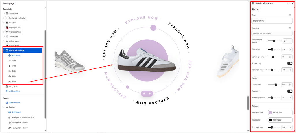
The Circle Slideshow (Circle Slider) is one of the most futuristic, high-impact interactive visual sections in the Sneax theme. Designed specifically for sneaker drops, collaboration spotlights, and flagship footwear showcases, it features a central 3D product carousel encircled by a planetary orbital disc, decorative satellite dots, and continuous rotating SVG circular typography paths.
Accessing the Circle Slideshow Section Settings #
- Open your Shopify Admin and navigate to Online Store > Themes.
- Click Customize next to your active Sneax theme.
- Use the top template picker dropdown to select the template (e.g., Home page, Collection, or custom landing page).
- In the left-hand sidebar, click Add section and select Circle slider (or click on an existing Circle slider section).
- The right sidebar will display all global section settings, orbital text properties, swiper controls, and nested Slide blocks.
1. General & Stage Dimensions #
Control the base theme color scheme and the physical diameter of the circular interactive stage.
| Setting | Type | Default | Options / Range | Description |
|---|---|---|---|---|
| Color scheme | Color Scheme | scheme-1 | Theme Color Schemes | Sets the background and base color canvas for the entire section container. |
| Stage size | Range | 640px | 300px to 800px (step: 20px) | Sets the desktop width and height of the circular planetary orbit. On mobile devices, this dimension automatically scales down proportionately to fit handheld screens perfectly without horizontal scrolling. |
2. Orbital Spinning Text & Typography Settings #
Sneax utilizes an SVG vector textpath that wraps seamlessly around the central footwear stage. You can customize the phrase, repetition frequency, typography scale, and rotation speed.
| Setting | Type | Default | Options / Range | Description |
|---|---|---|---|---|
| Ring text | Text | Explore now - | Text input | The headline or mantra that bends along the circular path. Automatically rendered in uppercase formatting. |
| Ring link | URL | None | Page / Collection / Product / Custom URL | Optional destination URL. When assigned, clicking anywhere along the rotating text path redirects the customer directly to that link. |
| Ring text repeat count | Range | 6 | 2 to 12 (step: 2) | Defines how many times your phrase repeats around the 360-degree orbit. Sneax automatically alternates the styling between base text color and accent color (is-accent) for every other phrase instance to create rhythmic visual contrast. |
| Ring font size | Range | 20px | 12px to 40px (step: 1px) | Controls the typographic scale of the orbital text. |
| Ring letter spacing | Range | 6px | 0px to 16px (step: 1px) | Adjusts the tracking between letters to ensure legible curved text along the circular trajectory. |
| Auto rotate text | Checkbox | true | Checked / Unchecked | When enabled, activates continuous infinite clockwise rotation for the orbital typography ring. |
| Rotation speed | Range | 40s | 10s to 120s (step: 5s) | Sets the duration in seconds for one full 360-degree rotation. Lower values create fast, energetic motion; higher values create a smooth, subtle ambient drift. |
3. Orbit Color Customization #
Fine-tune the planetary backdrop disc, orbit rings, satellite accents, and typography tones.
| Setting | Type | Default | Options / Range | Description |
|---|---|---|---|---|
| Accent color | Color | #D3B9DB | Color picker | Sets the color for the central backdrop circular disc, outer orbital ring lines, planetary satellite dots, and alternating repeating phrases in the text ring. |
| Text color | Color | #000000 | Color picker | Sets the primary color for the standard (non-accented) phrases in the rotating circular text ring. |
4. Carousel & Autoplay Controls #
Configure the interactive Swiper engine that powers the 3D footwear card carousel located within the orbital center.
| Setting | Type | Default | Options / Range | Description |
|---|---|---|---|---|
| Autoplay slider | Checkbox | false | Checked / Unchecked | When checked, the footwear slide carousel transitions automatically without requiring manual customer interaction. |
| Autoplay delay | Range | 4s | 2s to 10s (step: 1s) | Determines the pause duration between automatic slide transitions when autoplay is enabled. |
Note: If more than 1 slide block is added, Sneax automatically renders sleek circular previous/next navigation buttons positioned at the outer flanks of the orbital stage for intuitive manual browsing.
5. Slide Content Blocks #
Add individual sneaker silhouettes, colorways, or lifestyle graphics to rotate inside the 3D carousel.
- Block Name: Slide
- Block Limit: Up to 12 slides
| Setting | Type | Default | Options / Range | Description |
|---|---|---|---|---|
| Image | Image Picker | None | Image file (.png, .webp, .jpg) | The footwear visual displayed inside the active slide card. For best results, use transparent PNG or WebP images of sneaker profiles. |
| Slide link | URL | None | Product / Collection / Landing Page URL | Optional direct link. Clicking the slide image navigates shoppers straight to the product or drop page. |
Spacing & Mobile Optimization #
Maintain clean structural hierarchy and spacing between adjacent storefront sections.
| Setting | Type | Default | Options / Range | Description |
|---|---|---|---|---|
| Top padding | Range | 50px | 0px to 200px (step: 2px) | Vertical spacing above the circular slider on desktop viewports. Automatically halved on mobile screens (< 768px). |
| Bottom padding | Range | 50px | 0px to 100px (step: 2px) | Vertical spacing below the circular slider on desktop viewports. Automatically halved on mobile screens (< 768px). |
Sneaker Store Best Practices #
- Use Transparent High-Resolution PNG Cutouts: Always upload isolated lateral (side-view) sneaker photos with transparent backgrounds. Transparent cutouts allow the central accent disc and orbital SVG lines to show through underneath the kicks, creating an authentic 3D floating effect.
- Punchy Orbital Typography & Drop Dates: Keep your Ring text short and impactful. Setting Ring text repeat count to
4or6ensures clean visual symmetry, while the alternating accent color naturally highlights key phrases. - Curate 4 to 6 Core Colorways: While up to 12 slides are supported, keeping 4 to 6 top colorways or angles prevents swiper clutter and delivers a high-speed, engaging browsing experience for mobile streetwear shoppers.