

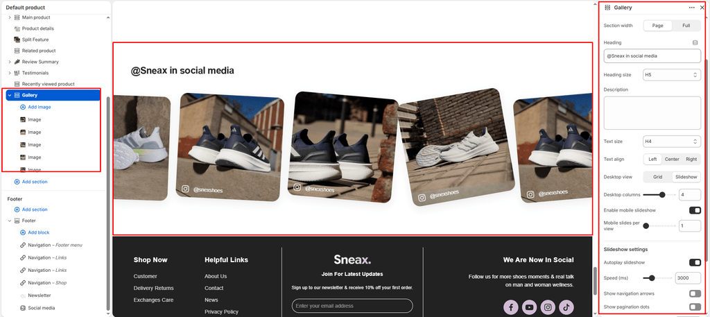
The Gallery section in Sneax is an interactive social proof and community showcase designed to bring your brand’s Instagram feed, streetwear lookbooks, and collector on-foot photography directly onto your storefront. Engineered with a contemporary 1:1 square aspect ratio, each card features an overlaid social button with an Instagram icon, custom profile avatar, and follow link.
Accessing the Gallery Section Settings #
- From your Shopify Admin, navigate to Online Store > Themes.
- Click Customize next to your active Sneax theme.
- In the top dropdown template selector, select Home page (or any custom landing page).
- In the left-hand sidebar, click (+) Add section and select Gallery (or Gallery slideshow).
- Click (+) Add block under the section to add individual Image cards.
1. Section Header & Typography Settings #
Configure section canvas width, color schemes, and header typography:
| Setting | Type | Default | Options / Range | Description |
|---|---|---|---|---|
| Color scheme | Color Scheme | scheme-1 | Theme Schemes | Controls the master background fill and text contrast colors for the section. |
| Section width | Select | page-width | page-width, full-width | Choose between a centered bounded container (page-width) or an edge-to-edge full width canvas (full-width). |
| Heading | Text | Section title | Text string | Main title displayed above the gallery (e.g., “FOLLOW US ON INSTAGRAM”, “AS SEEN ON THE STREETS”). |
| Heading size | Select | h4 | h1 to h6 | Sets the visual typography scale and font hierarchy of the section heading. |
| Description | Text Area | Blank | Multi-line text | Subtitle copy displayed beneath the gallery (renders with a stylish underline accent). |
| Text size | Select | h4 | h1 to h6 | Sets the font size of the descriptive text. |
| Text alignment | Select | left | left, center, right | Sets horizontal alignment for the heading and description. |
2. Multi-Device Layout Controls #
Toggle between an expansive multi-column grid or an interactive touch-swipeable carousel:
| Setting | Type | Default | Options / Range | Description |
|---|---|---|---|---|
| Desktop view | Select | slideshow | grid, slideshow | Select slideshow for a smooth Swiper carousel with progress bar navigation, or grid for an expansive multi-column showcase. |
| Desktop columns | Range | 5 | 1 to 6 (step: 1) | Determines how many square gallery cards appear per row on desktop screens (5 columns is ideal for a clean Instagram feed feel). |
| Enable mobile slideshow for grid | Checkbox | true | Checked / Unchecked | When desktop view is set to grid, checking this automatically converts mobile devices into a swipeable carousel to prevent endless vertical page scrolling. |
| Mobile slides per view | Range | 1 | 1 to 3 (step: 1) | Controls how many cards are visible simultaneously on mobile phone screens (1 to 2 slides is recommended). |
3. Slideshow Automation & Navigation Controls #
Customize carousel navigation and autoplay timers when slideshow mode is active:
| Setting | Type | Default | Options / Range | Description |
|---|---|---|---|---|
| Autoplay slideshow | Checkbox | false | Checked / Unchecked | Toggles automated slide transitions without requiring manual user swiping. |
| Slideshow speed | Range | 3000ms | 1000ms to 9000ms (step: 100ms) | Adjusts the slide transition delay (3000ms = 3 seconds per slide). |
| Show navigation arrows | Checkbox | true | Checked / Unchecked | Displays rounded pill previous and next arrow buttons. |
| Show pagination | Checkbox | true | Checked / Unchecked | Displays a horizontal progress bar indicator showing current slide progression. |
4. Gallery Image Block Settings #
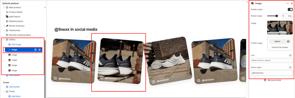
Each photo in the gallery is added as an Image block:
| Setting | Type | Default | Options / Range | Description |
|---|---|---|---|---|
| Enable rotate | Checkbox | false | Checked / Unchecked | Enables a fixed rotation tilt on this specific card for a scattered polaroid look. |
| Rotate range | Range | 0deg | -10deg to 10deg (step: 1deg) | Sets the initial static rotation angle in degrees (e.g., -3deg or 4deg). |
| Image | Image Picker | Blank | Image upload | High-resolution square (1:1) photo of sneaker on-foot styling, store events, or unboxing shots (up to 1200px wide). |
| Account image | Image Picker | Blank | Image upload | Small circular avatar or profile picture (24x24px) displayed on the overlay button. |
| Link | URL | Blank | Web / Social URL | External URL to your Instagram profile/post (e.g., https://instagram.com/yourstore) or internal product link. |
| Link label | Text | FOLLOW NOW | Text string | Actionable button copy overlaid across the bottom of the card (e.g., “@sneax_official”, “Shop This Fit”). |
5. Spacing & Mobile Optimization #
Fine-tune vertical breathing room across desktop and handheld devices:
| Setting | Type | Default | Options / Range | Description |
|---|---|---|---|---|
| Top padding | Range | 100px | 0px to 200px (step: 5px) | Vertical padding above the gallery section on desktop monitors. |
| Bottom padding | Range | 100px | 0px to 100px (step: 1px) | Vertical padding below the gallery section on desktop monitors. |
Responsive Behavior: On screens narrower than 767px, top and bottom padding are automatically reduced by 50% to maintain compact screen usage. On mobile, gap between grid cards reduces from 24px to 16px, and mobile slideshow mechanics ensure smooth finger-swipe browsing.
Interactive 3D Tilt Mechanics #
The Gallery section includes built-in mouse-tracking physics (initTiltAnimation):
- Dynamic 3D Tilting: When a user hovers over an image card on desktop, the theme calculates the cursor’s exact coordinates relative to the card bounds.
- Smooth Reset: Moving the cursor off the card triggers a smooth cubic-bezier transition that returns the image to its resting position.
Sneaker Store Best Practices #
- Tag Real Instagram Influencers & Handles: When featuring customer UGC or influencer on-foot photos, upload the creator’s avatar in the Account image setting and enter their handle into the Link label (e.g.,
@sneaker_sneax). Authenticating real community members builds immense trust with potential buyers. - Scatter Cards with Subtle Polaroid Rotation: Turn on Enable rotate across alternating cards and set subtle tilt angles (e.g., Card 1:
-2deg, Card 2:3deg, Card 3:-1deg, Card 4:2deg). This creates a stylish, scattered moodboard feel that mimics streetwear lookbook collages. - Keep Mobile Slideshow Enabled: With 5 to 8 images in your gallery, a vertical mobile stack pushes vital footer and conversion links down the page. Always keep Enable mobile slideshow for grid checked to let customers swipe horizontally through your social lookbook.