

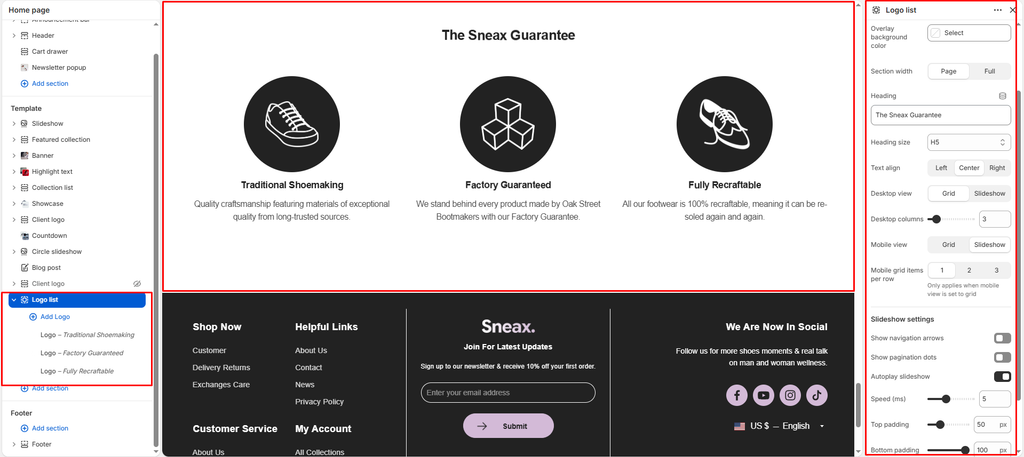
The Logo List section in Sneax is a dedicated trust-building and brand navigation tool. Whether showcasing authorized sneaker brands (such as Nike, Jordan, adidas, New Balance, and ASICS), highlighting secure payment gateways, or broadcasting press and publication features, this section provides an instantly recognizable visual index.
Accessing the Logo List Section Settings #
- From your Shopify Admin, navigate to Online Store > Themes.
- Click Customize next to your active Sneax theme.
- In the top dropdown template selector, select Home page (or any other page template).
- In the left-hand sidebar, click (+) Add section and select Logo list.
- Click (+) Add block under the section to insert individual Logo blocks.
1. Section Header & Container Styling Settings #
Configure container width, background color fills, and header alignment:
| Setting | Type | Default | Options / Range | Description |
|---|---|---|---|---|
| Color scheme | Color Scheme | scheme-1 | Theme Schemes | Controls the master section background and typography contrast. |
| Container background color | Color | Blank | Color picker (HEX) | Optional background color override applied specifically to the inner logo card container. |
| Section width | Select | page-width | page-width, full-width | Choose between a centered bounded container (page-width) or an edge-to-edge canvas (full-width). |
| Heading | Text | Our Partners | Text string | Prominent title displayed above the logos (e.g., “FEATURED BRANDS”, “OFFICIAL SNEAKER PARTNERS”, “PAYMENT METHODS”). |
| Heading size | Select | h4 | h1 to h6 | Sets the visual typography scale and font hierarchy of the section heading. |
| Text alignment | Select | left | left, center, right | Sets horizontal alignment for the section heading. |
2. Desktop & Mobile Layout Controls #
Configure responsive columns and display formats across screen viewports:
| Setting | Type | Default | Options / Range | Description |
|---|---|---|---|---|
| Desktop view | Select | grid | grid, slideshow | Select grid to display logos across static columns, or slideshow for an interactive swiper carousel. |
| Desktop items per row | Range | 4 | 2 to 10 (step: 1) | Determines how many circular logo medallions appear per row on desktop screens (4 to 6 items provide optimal sizing). |
| Mobile view | Select | grid | grid, slideshow | Select grid for a multi-row mobile grid, or slideshow for a finger-swipeable horizontal track. |
| Mobile grid items | Select | 2 | 1, 2, 3 | Determines how many logos appear per row on mobile devices when mobile view is set to grid. |
3. Slideshow Automation & Navigation Controls #
Fine-tune carousel controls when slideshow mode is active:
| Setting | Type | Default | Options / Range | Description |
|---|---|---|---|---|
| Autoplay | Checkbox | true | Checked / Unchecked | Automatically cycles through brand logos continuously without requiring manual user swiping. |
| Slide speed | Range | 5s | 2s to 10s (step: 1s) | Adjusts the autoplay rotation interval in seconds (5s ensures comfortable logo visibility). |
| Show navigation arrows | Checkbox | true | Checked / Unchecked | Displays circular next and previous arrow buttons beneath the carousel. |
| Show pagination | Checkbox | true | Checked / Unchecked | Displays a horizontal progress bar indicator showing current slide progression. |
4. Logo Content Blocks #
Each individual brand or partner is added as a Logo block:
| Setting | Type | Default | Options / Range | Description |
|---|---|---|---|---|
| Image | Image Picker | Blank | Image upload | Transparent PNG or SVG logo graphic. Renders inside a 180px circular medallion with automatic hover zoom. |
| Heading | Text | Payment options | Text string | Brand or partner title displayed beneath the circular medallion (e.g., “Nike”, “Jordan”, “adidas”, “Klarna”). |
| Text | Text Area | We offer multiple secure... | Multi-line text | Optional supporting description, tagline, or brand blurb. |
| Link | URL | Blank | Page / Collection URL | Clickable destination web link (e.g., linking directly to /collections/nike or /collections/air-jordan). |
5. Spacing & Mobile Optimization #
Manage vertical layout padding:
| Setting | Type | Default | Options / Range | Description |
|---|---|---|---|---|
| Top padding | Range | 35px | 0px to 200px (step: 5px) | Vertical padding above the logo section on desktop monitors. |
| Bottom padding | Range | 36px | 0px to 100px (step: 1px) | Vertical padding below the logo section on desktop monitors. |
Responsive Behavior: On screens narrower than 767px, top and bottom padding values are automatically scaled down by 50%. Setting Mobile view to slideshow eliminates vertical clutter and allows mobile shoppers to browse brand partners smoothly with swipe gestures.
Sneaker Store Best Practices #
- Use as a Fast Brand Filter Menu: Upload clean monochrome logos for your top 5 footwear brands (Nike, Air Jordan, adidas, New Balance, Yeezy). Attach direct collection URLs to each block’s Link setting so shoppers can immediately jump into their preferred brand catalog right from the homepage.
- Use Transparent Logos for Uniform Medallions: Upload transparent PNG or SVG vector logos. The circular medallion uses your theme’s high-contrast surface color, ensuring all brand logos look clean, balanced, and uniform without messy white square backgrounds.
- Turn on Mobile Slideshow for Catalogs with Brands: If you stock more than 6 brands, a static mobile grid creates a tall list of cards. Set Mobile view to
slideshowwithautoplayenabled to keep your homepage compact while continuously showcasing brand variety.