Table of Contents
The Header is the central command center of your storefront. In Sneax, the header is engineered to deliver a world-class shopping experience for sneakerheads and footwear enthusiasts—combining flexible logo layouts, floating transparent modes, instant voice search, and high-performance visual Mega Menus.
How to Access Header Settings #
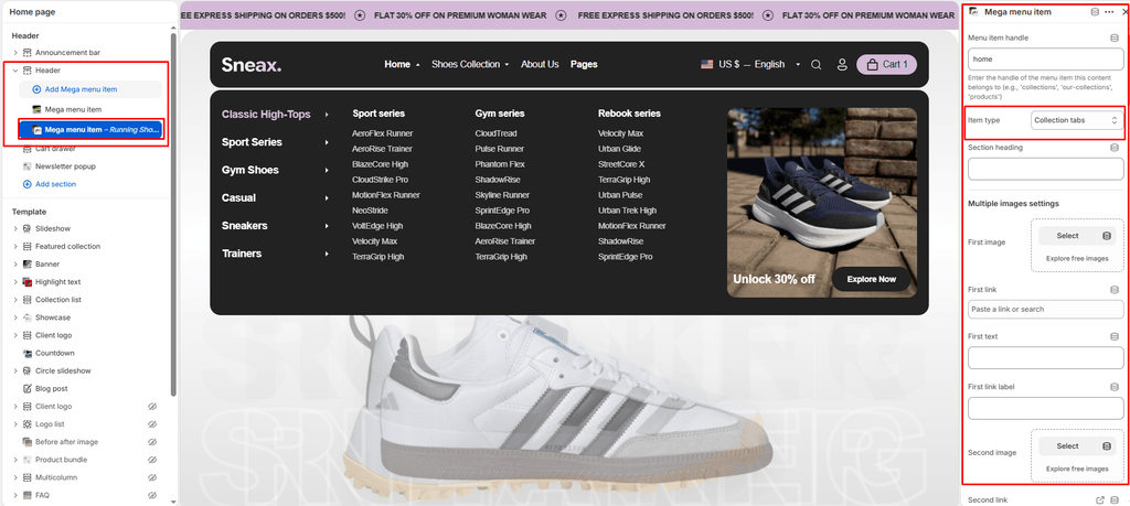
- From your Shopify Admin, navigate to Online Store > Themes.
- Click Customize on the Sneax theme.
- In the left sidebar under the Header group, click Header.
- Configure your layout and menu preferences, or click Add Mega menu item to create visual dropdown menus.
- Click Save.
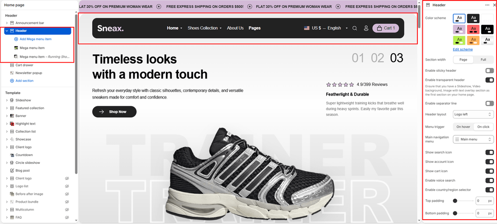
Header Layout & Style Settings #
| Setting Name | Type | Options / Range | Default | Description |
|---|---|---|---|---|
| Color scheme | Color Scheme Picker | Any configured color scheme | Scheme 1 | Sets the background and text color scheme for the main header navigation bar. |
| Drawer color scheme | Color Scheme Picker | Any configured color scheme | Scheme 1 | Sets a separate color scheme specifically for the slide-out mobile menu and desktop drawer. |
| Section width | Dropdown | Page width, Full width | Page width | Controls whether header navigation stays within the standard site container or spans edge-to-edge. |
| Sticky header | Checkbox | Enabled / Disabled | Enabled (true) | When enabled, the header smoothly locks to the top of the screen as customers scroll down. |
| Transparent header | Checkbox | Enabled / Disabled | Enabled (true) | Creates a transparent floating header overlay over your top-level Hero Banners or Slideshow sections. |
| Show line separator | Checkbox | Enabled / Disabled | Enabled (true) | Displays a thin, elegant bottom border line beneath the header navigation. |
| Header style | Dropdown | Logo centered, Logo left, Logo top, Drawer | Logo centered | Determines the architectural placement of your brand logo and primary navigation. |
| Top padding | Slider / Range | 0px – 200px (Step: 5px) | 0px | Fine-tunes vertical spacing above the header. |
| Bottom padding | Slider / Range | 0px – 100px (Step: 1px) | 0px | Fine-tunes vertical spacing below the header. |
Header Styles Explained #
- Logo Centered (Default): Places your sneaker brand logo in the center of the bar with primary navigation and action icons balanced on both sides.
- Logo Left: Traditional high-converting e-commerce layout—logo on the far left, followed by navigation links, and utility icons on the far right.
- Logo Top: Features a stacked two-tier layout: a top brand bar featuring your centered logo, utility icons, and localization tools, accompanied by a dedicated bottom row exclusively for navigation menus.
- Drawer (Minimalist): Keeps the top bar ultra-clean by tucking all navigation links inside an animated hamburger slide-out drawer, even on desktop screens.
Navigation & Utility Controls #
| Setting Name | Type | Default | Description |
|---|---|---|---|
| Main menu | Menu Picker | main-menu | Selects your primary Shopify navigation link list. |
| Menu trigger | Dropdown (Hover, Click) | Hover | Determines whether dropdowns and mega menus reveal on mouse hover (fastest for desktop shoppers) or explicit clicks. |
| Show search icon | Checkbox | Enabled | Toggles the search icon in the header. |
| Show account icon | Checkbox | Enabled | Toggles customer profile/login icon. |
| Show cart icon | Checkbox | Enabled | Toggles the shopping cart drawer trigger icon. |
| Enable voice search | Checkbox | Enabled | Enables speech-to-text voice recognition inside the search bar. |
| Enable country/region selector | Checkbox | Enabled | Displays the international currency and language selector. |
Creating Visual Mega Menus (Mega Menu Item Block) #
To transform a standard menu link into an expansive visual mega menu, click Add block under Header and select Mega menu item.
1. Connect to Parent Link #
- Parent Mega Menu (
parent_mega_menu): Enter the exact name of the navigation link in your Main Menu where this mega menu should attach (e.g.,Shoes,Men,Drops, orCollections).
2. Select Item Type (item_type) #
Sneax supports 6 specialized mega menu layouts:
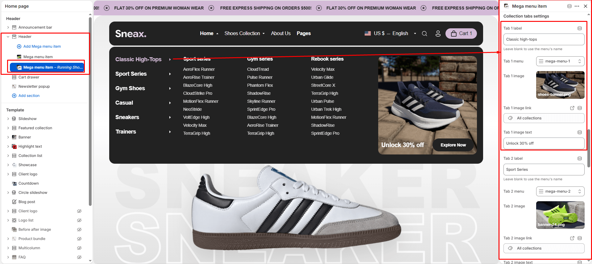
- Collection Tabs (Signature Sneax Feature):
- Displays up to 6 interactive tabs (e.g., Men’s Running, Women’s Casual, Basketball, High-Tops, Collaborations).
- Each tab can have its own sub-menu, promotional shoe image, banner text, and clickable link. Hovering over each tab dynamically updates the menu content.
- Image:
- Showcase up to 4 promotional campaign cards side-by-side inside the dropdown.
- Each image includes its own custom headline, subtext, and call-to-action button link (ideal for highlighting limited sneaker drops and collabs).
- Products:
- Select any collection to showcase live shoe cards with images, titles, and prices directly in the menu.
- Set Product limit from
1to8items (default:4).
- Collections:
- Display up to 4 featured footwear categories (
Collection 1throughCollection 4) with their collection cover photos.
- Display up to 4 featured footwear categories (
- Blogs:
- Highlight up to 8 editorial articles from your sneaker journal or release guide.
- Page:
- Link up to 4 informational pages (e.g., Shoe Sizing Chart, Shoe Care Guide, Return Policy).
Pro Tips for Sneax Footwear Stores #
- Leverage Collection Tabs for Large Catalogs: If your footwear brand carries multiple sports or categories, use the Collection tabs item type. Shoppers can preview your entire footwear hierarchy from a single menu without page hopping.
- Promote Drops in Mega Menus: When launching an exclusive sneaker raffle or release, use the Image mega menu block to place a high-res photo of the shoe and a “Shop the Drop” button right inside the main navigation.