

- Accessing the Showcase Section Settings
- 1. Master Section & Header Typography Settings
- 2. Main Sneaker Card Settings (Hotspot Hero)
- 3. Video Modal Card Configuration
- 4. Stats & Social Proof Card Settings
- 5. Content Blocks: Interactive Feature Hotspots
- 6. Spacing & Mobile Optimization
- Sneaker Store Best Practices
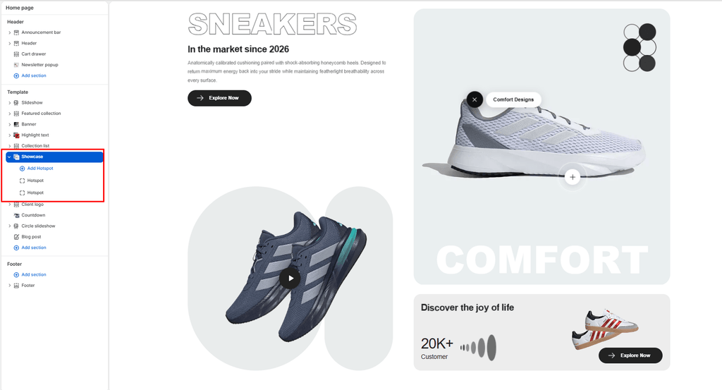
The Showcase section is the ultimate flagship product storytelling centerpiece in the Sneax theme. Designed to spotlight a hero silhouette or marquee collaborative release, it merges multiple media dimensions into a cohesive, high-converting visual experience: an oversized stroke-outline headline, an interactive Video Lightbox Modal, a floating 3D Sneaker Hero Card with Feature Hotspot Pins, and a supplementary Social Proof Stats Card.
Accessing the Showcase Section Settings #
- From your Shopify Admin, navigate to Online Store > Themes.
- Click Customize next to your active Sneax theme.
- In the top dropdown template selector, select Home page (or a dedicated product launch landing page).
- In the left-hand sidebar, click (+) Add section and select Showcase.
- Click (+) Add block under the section to add or adjust your Hotspot pins (up to 4 blocks).
1. Master Section & Header Typography Settings #
Configure container boundaries, color contrast, and primary editorial messaging:
| Setting | Type | Default | Options / Range | Description |
|---|---|---|---|---|
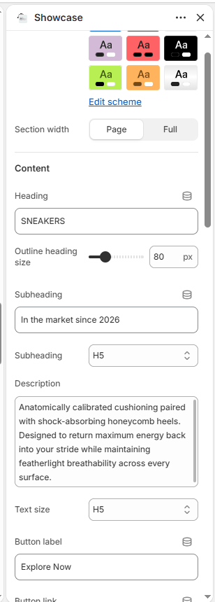
| Color scheme | Color Scheme | scheme-1 | Theme Schemes | Controls the master background fill and text contrast colors for the section. |
| Section width | Select | page-width | page-width, full-width | Choose between a centered bounded container (page-width) or an edge-to-edge canvas (full-width). |
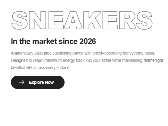
| Heading | Text | SNEAKERS | Text string | Massive stroke-outline headline (e.g., “RETRO 4”, “ICONIC HEAT”, “AIR JORDAN”). |
| Heading font size | Range | 110px | 40px to 200px (step: 2px) | Directly adjusts the desktop font size of the outline headline (automatically halved on mobile). |
| Subheading | Text | In the market since 2026 | Text string | Secondary subtitle kicker placed beneath the outline headline. |
| Subheading size | Select | h4 | h1 to h6 | Sets the visual typography scale and font hierarchy of the subheading. |
| Description | Text Area | Every piece begins with... | Multi-line text | Detailed editorial narrative highlighting footwear heritage or materials. |
| Text size | Select | h6 | h1 to h6 | Sets the font size of the descriptive narrative text. |
| Button label | Text | Explore Now | Text string | Actionable button copy (e.g., “Shop The Silhouette”, “Enter Draw”). |
| Button link | URL | Blank | Page / Collection URL | Destination web link for the primary action button. |
| Button style | Select | button-primary | button-primary, button-secondary, button-link | Visual button styling (solid primary, outlined secondary, or minimalist text link). |
| Button icon | Select | arrow | cart, quickview, location, phone, arrow, email, account, search, heart | Displays a clean vector icon alongside the button text. |
2. Main Sneaker Card Settings (Hotspot Hero) #
Configure the prominent 3D sneaker hero card anchored in the upper-right quadrant:
| Setting | Type | Default | Options / Range | Description |
|---|---|---|---|---|
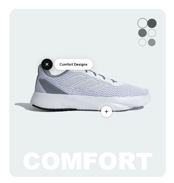
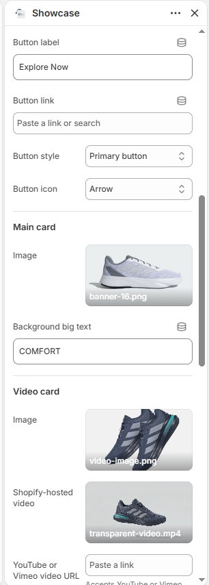
| Main image | Image Picker | Blank | Image upload | Cutout photograph of the featured sneaker. Automatically receives a continuous floating keyframe animation (mainSneakerFloat). |
| Main background text | Text | COMFORT | Text string | Giant 15cqw background watermark typography running across the base of the card (e.g., “AIR”, “HERITAGE”, “DUNK”). |
3. Video Modal Card Configuration #
Configure the video card situated in the lower-left quadrant:
| Setting | Type | Default | Options / Range | Description |
|---|---|---|---|---|
| Video image | Image Picker | Blank | Image upload | High-resolution thumbnail image featured on the video preview card. |
| Video | Video Picker | Blank | Shopify Files MP4 | Native MP4 video file. Clicking the play button triggers a full-screen video lightbox modal. |
| Video URL | Video URL | Blank | YouTube / Vimeo URL | External video URL alternative (accepts YouTube and Vimeo video IDs). |
| Video pill shape color | Color | #E9ECEC | Color picker (HEX) | Background color applied to the pill-shaped decorative backdrop framing the video thumbnail. |
4. Stats & Social Proof Card Settings #
Configure the milestone and proof-of-volume card anchored in the lower-right quadrant:
| Setting | Type | Default | Options / Range | Description |
|---|---|---|---|---|
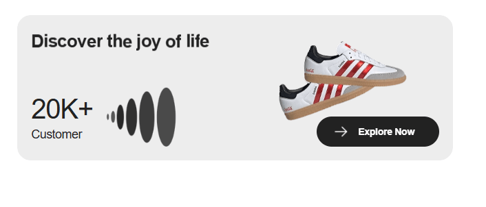
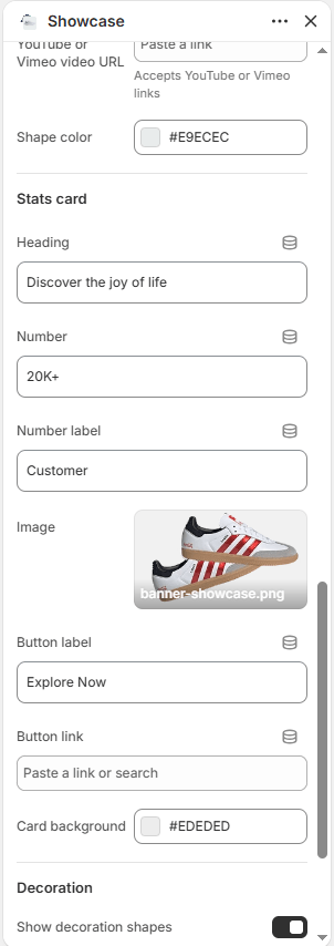
| Stats heading | Text | Discover the joy of life | Text string | Title for the stats card (e.g., “TRUSTED BY COLLECTORS WORLDWIDE”). |
| Stat number | Text | 20K+ | Text string | Large bold milestone metric (e.g., “50K+”, “100%”, “4.9/5”). |
| Stat label | Text | Customer | Text string | Subtitle label placed beside the metric (e.g., “Pairs Authenticated”, “Verified Reviews”). |
| Stats image | Image Picker | Blank | Image upload | Supporting photo embedded inside the stats card (e.g., boutique storefront or packaging shot). |
| Stats button label | Text | Explore Now | Text string | Action button text within the stats card. |
| Stats button link | URL | Blank | Page / Collection URL | Destination web link for the stats card button. |
| Stats card background | Color | #EDEDED | Color picker (HEX) | Background fill color for the stats container. |
| Show decoration | Checkbox | true | Checked / Unchecked | Toggles geometric vector design accents (animated floating circle matrix and graduated ellipses). |
5. Content Blocks: Interactive Feature Hotspots #
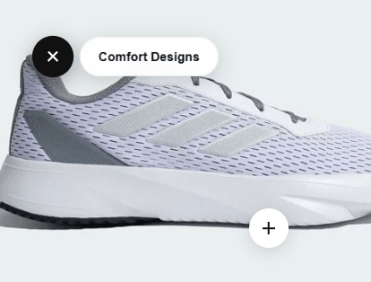
Merchants can place up to 4 Hotspot blocks directly over the main sneaker card to highlight specific technological innovations or material details:
| Setting | Type | Default | Options / Range | Description |
|---|---|---|---|---|
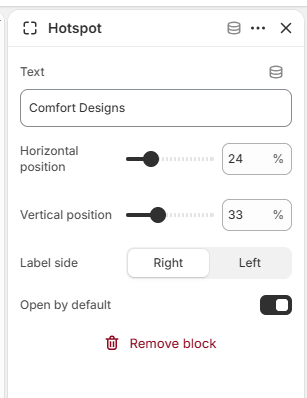
| Label | Text | Comfort Designs | Text string | Feature callout text (e.g., “Breathable Toe Mesh”, “Encapsulated Air Sole”, “Premium Suede Overlays”). |
| Horizontal position (X) | Range | 24% | 0% to 100% (step: 1%) | Sets the horizontal coordinate of the pin across the sneaker image from left to right. |
| Vertical position (Y) | Range | 33% | 0% to 100% (step: 1%) | Sets the vertical coordinate of the pin down the sneaker image from top to bottom. |
| Label position | Select | right | left, right | Determines whether the glassmorphic feature label expands to the left or right of the pin. |
| Open by default | Checkbox | false | Checked / Unchecked | When checked, the feature label stays open on initial page load without requiring a click. |
Hotspot Interaction: Hotspot buttons feature a continuous radar-ping wave animation. Clicking the button rotates the plus icon by 135 degrees into an “x” close button and reveals a frosted glassmorphism text badge.
6. Spacing & Mobile Optimization #
Manage vertical layout breathing room:
| Setting | Type | Default | Options / Range | Description |
|---|---|---|---|---|
| Top padding | Range | 50px | 0px to 200px (step: 5px) | Vertical padding above the showcase section on desktop monitors. |
| Bottom padding | Range | 50px | 0px to 100px (step: 1px) | Vertical padding below the showcase section on desktop monitors. |
Responsive Behavior: On screens narrower than 767px, top and bottom padding values are automatically scaled down by 50%. The massive outline headline scales down by 50% to prevent word breaks, and the multi-card layout reorganizes into a linear mobile stack with full touch support for video popups and hotspot pins.
Sneaker Store Best Practices #
- Tag 2 to 3 Specific Technological Details: Avoid generic hotspot labels like “Nice Shoe”. Instead, educate sneakerheads on exact engineering details:
- Leave One Hotspot “Open by Default”: Check Open by default on your primary hotspot block (e.g., the sole cushioning pin). This immediately shows visitors that the image is interactive and invites them to tap the other pins.
- Use the Video Modal for Unboxing or Factory Crafting: Upload an authentic 30-to-60-second video of an unboxing, heel-to-toe flex test, or factory sole-stitching demonstration. Interactive video verification builds tremendous buyer confidence for premium sneakers.