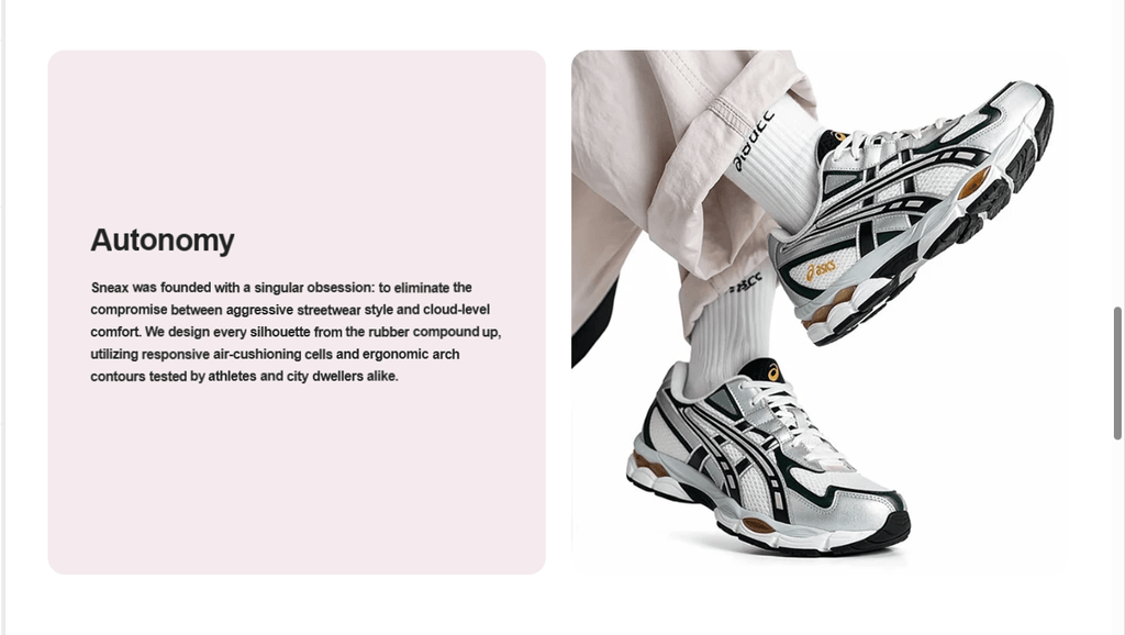
The Image with Text section in Sneax is an editorial storytelling powerhouse designed to build deep brand connection, showcase sneaker craftsmanship, and highlight exclusive capsule drops. It organizes content into an elegant 50/50 split layout: one half showcases high-resolution footwear photography, while the adjacent half provides rich typography, brand narratives, supplementary accent visuals, and an interactive call-to-action button.
Unlike complex multi-block sections, the Image with Text section consolidates all layout, media, and typography settings directly into a single clean interface. Furthermore, by stacking two or more of these sections consecutively and alternating the image orientation (Left to Right, then Right to Left), merchants can effortlessly construct a dynamic, editorial “zigzag” narrative flow down the page.
Accessing the Image with Text Section Settings #
- From your Shopify Admin, navigate to Online Store > Themes.
- Click Customize next to your active Sneax theme.
- In the top dropdown template selector, select Home page (or any custom page template, such as an “About Us” or “Authenticity Guarantee” page).
- In the left-hand sidebar, click (+) Add section and choose Image with text.
- Click directly on Image with text in the sidebar to reveal all customization settings in the inspector panel.
1. Layout & Orientation Settings #
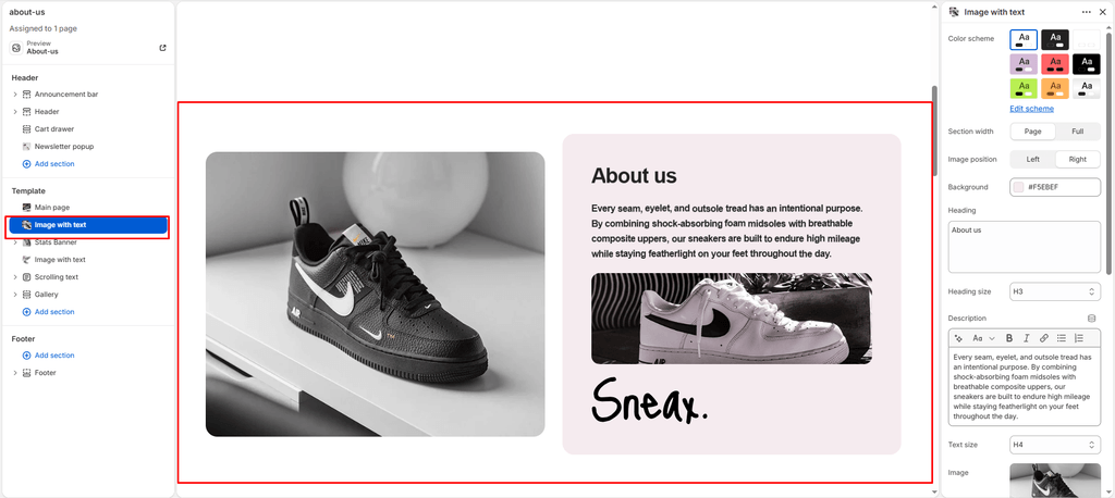
Control the overall section width, color schemes, image alignment, and custom card background accents:
| Setting | Type | Default | Options / Range | Description |
|---|---|---|---|---|
| Color scheme | Color Scheme | scheme-3 | Theme Schemes | Dictates the master section background and text contrast colors. |
| Section width | Select | page-width | page-width, full-width | Choose between a centered bounded container (page-width) or a full edge-to-edge canvas (full-width). Full-width is particularly popular for creating seamless zigzag storytelling blocks. |
| Image position | Select | left | left, right | Determines which side the featured image occupies on desktop screens. Set to left for Image-Left / Text-Right, or right for Text-Left / Image-Right. |
| Background color | Color | #f2f6f4 | Color picker (HEX) | Directly overrides the background fill color of the text-content card, allowing for soft contrast cards or dark streetwear containers. |
2. Editorial Typography & Storytelling Settings #
Craft your sneaker release narrative with fine-grained typographic controls:
| Setting | Type | Default | Options / Range | Description |
|---|---|---|---|---|
| Heading | Text Area | Delivering quality you can trust, every single time | Multi-line text | Prominent editorial title for your narrative (e.g., “100% VERIFIED AUTHENTIC HEAT”, “CRAFTED FOR STREET CULTURE”). |
| Heading size | Select | h4 | h1 to h6 | Sets the visual typography scale and font hierarchy of the section heading. |
| Description | Rich Text | <p>Use this space to describe the purpose of the image...</p> | Rich text editor | Multi-paragraph brand copy detailing materials, cushioning technology, limited release heritage, or return policies. |
| Text size | Select | h5 | h1 to h6 | Sets the font size of the descriptive text paragraph. |
3. Featured Media & Brand Signature Assets #
Incorporate master lifestyle shots, inline product vignettes, and personal designer/authentication sign-offs:
| Setting | Type | Default | Options / Range | Description |
|---|---|---|---|---|
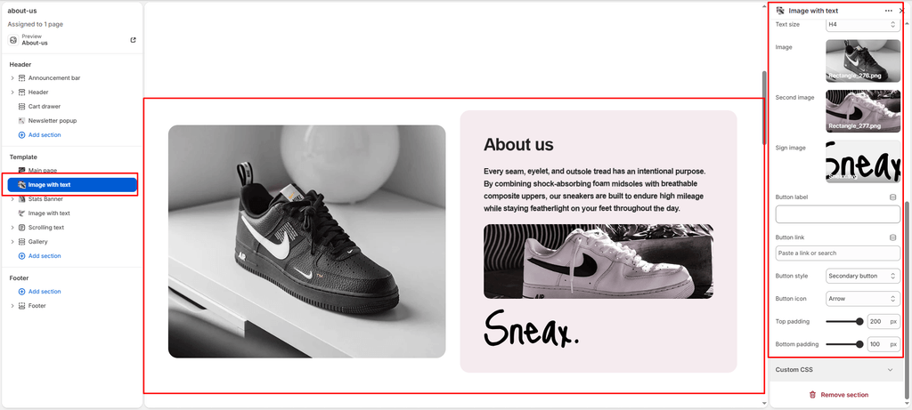
| Image | Image Picker | Blank | Image upload | The primary high-resolution photography featured on the visual half of the section. Supports responsive scaling up to 2000px wide. |
| Content secondary image | Image Picker | Blank | Image upload | An optional supplementary image embedded directly inside the text container (ideal for showing a closeup of sneaker stitching, sole traction, or packaging). |
| Signature image | Image Picker | Blank | Image upload | An optional graphic image positioned below the copy (constrained to 200px wide). Perfect for a founder’s handwritten signature, master authenticator stamp, or boutique seal of approval. |
4. Call-to-Action Button Configuration #
Direct shoppers directly from the story into your sales funnel:
| Setting | Type | Default | Options / Range | Description |
|---|---|---|---|---|
| Button label | Text | Button label | Text string | Actionable button copy (e.g., “Explore The Drop”, “Read Our Verification Process”). If left empty, the button is hidden. |
| Button link | URL | /collections/all | Page / Collection URL | Destination URL for the button link. |
| Button style | Select | button-secondary | button-primary, button-secondary, button-link | Controls the button visual style (solid primary, outlined secondary, or minimalist text link). |
| Button icon | Select | arrow | cart, quickview, location, phone, arrow, email, account, search, heart | Renders a clean vector icon alongside the button text. |
5. Spacing & Mobile Optimization #
Fine-tune vertical spacing to ensure balanced layout rhythm across all viewport sizes:
| Setting | Type | Default | Options / Range | Description |
|---|---|---|---|---|
| Top padding | Range | 100px | 0px to 200px (step: 5px) | Vertical padding above the section on desktop screens. |
| Bottom padding | Range | 100px | 0px to 100px (step: 1px) | Vertical padding below the section on desktop screens. |
Responsive Behavior: On mobile devices under 767px wide, the layout automatically stacks vertically with the Image placed first (at the top) and the Text container placed second (underneath), regardless of whether desktop alignment is set to Left or Right. Padding is also automatically reduced by 50% on mobile to maintain clean, screen-efficient spacing.
Sneaker Store Best Practices #
- Build Alternating Zigzag Stories for Major Brand Collabs: Add two consecutive Image with Text sections on your homepage. Configure Section 1 with
image_position: right(focusing on shoe design) and Section 2 withimage_position: left(focusing on on-foot styling). This classic zigzag rhythm keeps collectors engaged while scrolling. - Utilize the Signature Graphic for Legit Checks & Trust: Sneakerhead shoppers care deeply about verification and authenticity. Upload an authentic “Verified by Sneax” holographic stamp or founder signature in the Signature image field to reassure buyers that every pair is 100% deadstock and authenticated.
- Show Details with the Inline Content Image: Use the main Image for an artistic full on-foot editorial shot, and use the Content secondary image inside the text box to display a macro close-up of premium suede textures, special packaging, or custom insoles.