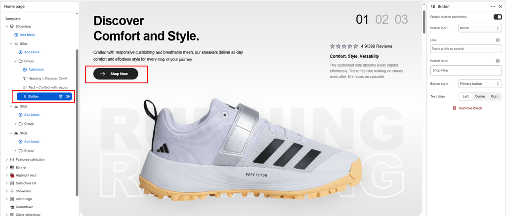
The Button block (identified internally as Link in the block catalog) is the primary Call-to-Action (CTA) element in Sneax. Whether directing collectors to a high-heat sneaker drop, launching an upcoming raffle page, exploring seasonal lookbooks, or linking to a sizing chart, this block drives conversion with high visual impact.
Every Button block in Sneax comes equipped with interactive kinetic hover animations and built-in vector SVG icons that animate on interaction.
Accessing the Button Block Settings #
- In the Shopify Theme Editor, navigate to any page template containing a compatible section (e.g., Banner, Slideshow, Video, or Custom Section).
- In the left-hand sidebar, locate the parent section or container.
- Click (+) Add block and select Button (secondary) or Link (or click an existing Button block).
- Customize the settings in the right-hand panel.
Block Settings #
| Setting | Type | Default | Options / Range | Description |
|---|---|---|---|---|
| Button label | Text | Button label | Free Text | The text displayed inside the button (e.g., “Shop Retro Drops”). |
| Link | URL | Blank | Store URL / External | The destination URL where the customer is redirected upon clicking. |
| Button style | Select | Primary button | Primary button, Secondary button, Link button | Controls the visual hierarchy and styling of the button. |
| Enable animation | Checkbox | Enabled | Toggle | Activates Sneax’s signature kinetic hover micro-animations. |
| Button icon | Select | cart | 9 Vector Icons | Selects an animated icon to pair with the button label. |
| Text align | Select | Left | Left, Center, Right | Controls horizontal alignment within the container. |
Detailed Setting Explanations #
1. Button Styles (style_class) #
Sneax provides three distinct styling presets that inherit their color schemes directly from your active section’s color palette:
- Primary button (
button-primary)(Default):- Solid high-contrast background fill with contrasting label text.
- Recommended for your primary conversion goals: “Shop Now”, “Buy Drop”, or “Add to Cart”.
- Secondary button (
button-secondary):- Sleek, elegant outline/border treatment with a translucent or muted background.
- Ideal for secondary options: “View Lookbook”, “Size Guide”, or “Read Story”.
- Link button (
button-link):- Minimalist underline text link.
- Great for subtle prompts: “Learn More”, “Terms & Conditions”, or “View All Archive”.
2. Animated Button Icons (button_icon) #
Every button can be paired with an SVG icon that animates dynamically when hovered or clicked:
| Icon Option | Visual Element | Best Use in Footwear Stores |
|---|---|---|
| cart (Default) | Shopping cart with rolling wheels & checkmark | Direct purchase CTAs (“Shop Now”, “Grab Your Pair”). |
| arrow | Directional right chevron / arrow line | Category discovery (“Explore Drop”, “View All Sneakers”). |
| quickview | Eye silhouette with animated pupil | Previewing releases or lookbook styles. |
| heart | Wishlist heart silhouette | Saving upcoming drops or favorite silhouettes. |
| search | Magnifying glass with search handle | Searching the footwear vault or catalog. |
| location | Map pin with animated pin-dot | Store locators, pop-up events, and retail boutiques. |
| phone | Telephone receiver with signal rings | VIP concierge, customer support, or orders desk. |
| Envelope with unfolding flap | Newsletter subscriptions or raffle entries. | |
| account | User profile avatar | Member portals, loyalty clubs, and order history. |
3. Kinetic Button Hover Animation (enable_animation) #
When enabled, Sneax adds the .button-anim class, activating custom CSS animations (assets/button-anim.css):
- Smooth background color transitions and scaling on hover.
- SVG icons perform unique micro-interactions (e.g., cart wheels rotate, arrow lines advance, email envelopes flap).
- When a button is disabled (e.g., sold-out releases), it gracefully dims to 60% opacity with an unclickable cursor.
4. Text Alignment (text_align) #
- Left (Default): Traditional editorial layout. Keep consistent with left-aligned headings and descriptions.
- Center: Standard for centered hero banners, countdown blocks, and 404/password templates.
- Right: Asymmetric, high-fashion streetwear lookbook alignment.
How to Create Side-by-Side Dual Buttons #
To offer shoppers dual choices (such as “Shop Men’s” alongside “Shop Women’s”):
- In the parent section, click (+) Add block and select Group.
- Click on the Group block and set Direction to Horizontal.
- Inside the Group block, add your First Button:
- Label:
Shop Men's - Style:
Primary button - Icon:
arrow
- Label:
- Add your Second Button inside the same Group block:
- Label:
Shop Women's - Style:
Secondary button - Icon:
arrow
- Label:
- Both buttons will now sit side-by-side in desktop view and gracefully wrap on mobile screens!
Sneaker Store Best Practices #
- Pair Primary & Secondary Styles:
- When offering dual options, make the main action Primary button (solid) and the secondary action Secondary button (outline). This prevents visual competition and guides the shopper’s eye.
- Use the Arrow Icon for Catalog Browsing:
- Setting the icon to
arrowprovides an intuitive directional cue that increases click-through rates on collection and banner links.
- Setting the icon to
- Match Button Alignment to Section Typography:
- If your Heading and Text blocks are centered, ensure your Button block is also set to
Centerto maintain clean visual symmetry.
- If your Heading and Text blocks are centered, ensure your Button block is also set to