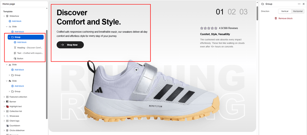
The Group block is a foundational layout container in Sneax that leverages Shopify’s modern Nested Block Architecture ({% content_for 'blocks' %}). It allows sneaker boutiques and footwear brands to bundle multiple independent child blocks (such as a Title, Subtitle, Text, Countdown, and dual Buttons) into a single cohesive layout unit.
Using Group blocks keeps your editorial design organized. Rather than having loose elements scattered within a section, bundling related blocks inside a Group ensures they move together as a single component when reordered in the Shopify Theme Editor.
1. How Nested Groups Work #
When you add a Group block to a compatible section (such as Banner, Slideshow, Video, Custom Section, or inside a Column), it acts as a flexible, empty structural wrapper:
- Add Child Blocks: Click (+) Add block indented directly beneath the Group block in the left-hand sidebar to insert any Universal Theme Block (
@theme) or App Block (@app). - Drag & Drop Reordering: Reorder child blocks within the group using the six-dot handle (
⋮⋮), or move the entire Group up and down within the parent section as one unified block. - Consistent Layout Bounds: Child blocks inside the group maintain uniform spacing and adapt automatically to desktop and mobile screen widths.
2. Block Settings #
Click on the Group block in the Theme Editor sidebar to customize its structural flow:
| Setting | Type | Default | Options | Description |
|---|---|---|---|---|
| Direction | Select | Vertical | Vertical, Horizontal | Controls the flex layout and orientation of child blocks nested inside this group. |
3. Direction Settings Explained #
Vertical (direction: vertical) #
- Stacks all nested child blocks neatly on top of each other.
- Built-in Flexbox styling (
display: flex; flex-direction: column; gap: 10px;) applies an exact 10px vertical gap between elements. - Best For: Creating clean typographic lockups (e.g., Subtitle $\rightarrow$ Headline $\rightarrow$ Sneaker Material Description).
Horizontal (direction: horizontal) #
- Places nested child blocks side-by-side in a responsive row.
- Built-in Flexbox styling (
display: flex; flex-direction: row; flex-wrap: wrap; align-items: center; justify-content: space-between;) automatically aligns items horizontally and allows them to wrap gracefully on smaller screens. - Sneax automatically applies
width: fit-content;to nested buttons so they don’t stretch artificially across the screen. - Best For:
- Placing Dual Call-to-Action Buttons side-by-side (e.g., “Shop Men’s” next to “Shop Women’s”).
- Placing a small trust badge Image right next to a Button.
- Aligning a Countdown Timer alongside a “Drop Alert” Heading.
4. Supported Child Blocks Inside a Group #
Because the Group block declares "blocks": [{ "type": "@theme" }, { "type": "@app" }], you can nest any of the following elements:
- Title (
title): Cascade-animated drop headlines. - Subtitle (
subtitle): Kicker tags (e.g., “Limited to 300 Pairs”). - Text (
text): Paragraph copy with opacity adjustments. - Rich Text (
richtext): Formatted text with bulleted feature lists. - Button / Link (
link): Primary, secondary, or link-style CTAs with animated SVG icons. - Countdown (
countdown): Live ticking drop timer. - Image (
image): Detail macro shots, certification logos, or trust seals. - App Blocks (
@app): Third-party review stars, size chart triggers, or stock badge widgets.
Step-by-Step: Creating Side-by-Side Dual Buttons #
A common requirement for sneaker brands is placing two buttons side-by-side in a hero section. Here is how to configure it in Sneax:
- In your Banner or Slideshow section, click (+) Add block and select Group.
- Click on the newly created Group block and set Direction to Horizontal.
- Under the Group block, click (+) Add block and select Button (secondary):
- Label:
Shop Men's Kicks - Style:
Primary button - Icon:
arrow
- Label:
- Under the same Group block, click (+) Add block and add a second Button (secondary):
- Label:
Shop Women's Kicks - Style:
Secondary button - Icon:
arrow
- Label:
- Both buttons will now sit side-by-side with clean spacing on desktop displays and stack neatly if screen width constricts on mobile!
Sneaker Store Best Practices #
- Drop Launch Lockup:
- Create a vertical Group containing a Subtitle (“Vault Restock”), a Title (“AIR JORDAN 4 RETRO”), and a Countdown block set to your drop date. This ensures the headline and timer stay visually connected as a single announcement pod.
- Dual-Category Navigation in Hero Banners:
- Use a horizontal Group containing two buttons to segment high-volume traffic immediately: one leading to high-top retros and the other to low-top lifestyle sneakers.
- Combine Badges with Action Buttons:
- In a horizontal Group, insert a small verified authentic Image badge alongside an “Order Now” Button to give buyers final reassurance on checkout-intent banners.