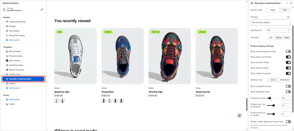
The Recently Viewed Products section is a high-converting dynamic feature that allows sneakerheads and shoppers to effortlessly retrace their steps and jump back to footwear they recently explored.
Whether a buyer is comparing different silhouettes, deliberating over colorways, or returning from browsing release drops, this section leverages lightweight, client-side browser storage (localStorage) to remember up to 12 recently viewed kicks and dynamically renders them without slowing down page load times.
Zero-Flicker & Smart Cleanliness:
Self-Exclusion on Product Pages: When rendered on a product page, the section automatically filters out the currently viewed shoe so shoppers are never shown a duplicate of the sneaker they are already inspecting.
Auto-Hides When Empty: If a first-time visitor has no browsing history yet, the section remains completely hidden (display: none), ensuring your storefront never displays an awkward empty space or broken layout.
Where to Add This Section #
While most commonly placed near the bottom of Default Product pages (below the Main Product details and customer reviews), you can also add this section to:
- Homepage: Welcoming returning collectors back with the kicks they were eyeing during their last visit.
- Cart Page / Drawer Page: Giving shoppers a final opportunity to add shoes they were deliberating on before proceeding to checkout.
- Collection & Lookbook Pages: Keeping recently viewed styles accessible as customers browse wider catalogs.
To add the section, navigate to your Shopify Theme Editor, open the desired template (e.g., Products > Default product), click (+) Add section in the sidebar, and select Recently viewed products.
1. Layout & Header Settings #
Configure the fundamental styling, container bounds, and title hierarchy of the section:
| Setting | Type | Default | Options / Range | Description |
|---|---|---|---|---|
| Color scheme | Color Scheme | scheme-1 | Theme Schemes | Sets the background and text contrast colors across the entire section. |
| Section width | Select | Full-width | Page-width, Full-width | Choose Page-width to constrain the products within your standard grid container or Full-width for edge-to-edge presentation. |
| Heading | Text | You recently viewed | Free text | The section header displayed above the products (e.g., “Recently Viewed Kicks”, “Pick Up Where You Left Off”). |
| Heading size | Select | H4 | H1 – H6 | Controls the typography scale of the section title to match your store’s typographic hierarchy. |
| Text align | Select | Left | Left, Center, Right | Aligns the section heading to the left, center, or right of the screen. |
2. Product Card Customization #
Fine-tune the exact sneaker metadata, interaction points, and media shown on each product card:
- Show secondary image on hover (
product_card_show_secondary_image):- Default: Disabled
- When enabled, hovering over a sneaker card reveals the secondary product image (e.g., showing the on-foot profile angle, heel tab, or outsole tread pattern).
- Show quick add button (
show_add_to_cart):- Default: Enabled
- Renders a prominent Add to Cart / Quick View button directly on the card so buyers can select their size and checkout without reopening the full product page.
- Show vendor (
product_card_show_vendor):- Default: Enabled
- Displays the sneaker brand or manufacturer (e.g., Nike, Jordan, New Balance, adidas, ASICS) directly above the product title.
- Show product rating (
product_card_show_rating):- Default: Enabled
- Displays social proof star ratings and review counts from your connected review app.
- Show variant swatches (
show_variant_swatches):- Default: Enabled
- Renders interactive colorway pills/swatches beneath the product title, allowing customers to preview different finishes and colorways immediately.
3. Desktop View & Slider Controls #
Sneax gives you total control over whether your recently viewed products appear in a fixed responsive grid or an interactive carousel:
- Desktop view (
desktop_view):- Grid (Default): Arranges recently viewed sneakers into clean, structured columns.
- Slideshow: Converts the products into a smooth, draggable Swiper carousel, ideal for displaying larger collections without occupying extensive vertical screen space.
- Show navigation (
show_navigation):- Default: Enabled (Active when Slideshow is selected)
- Displays circular Left (
<) and Right (>) chevron buttons to advance the carousel.
- Show pagination (
show_pagination):- Default: Enabled (Active when Slideshow is selected)
- Renders a modern horizontal slider progress bar indicating how far the user has scrolled through the carousel.
4. Responsive Grid & Product Counts #
Customize product caps and multi-device column layouts:
| Setting | Type | Default | Range / Step | Description |
|---|---|---|---|---|
| Products limit | Range Slider | 8 | 2 – 50 (step 1) | The maximum number of previously viewed items to fetch and display in the section. |
| Desktop products per row | Range Slider | 4 | 2 – 6 (step 1) | Number of columns displayed simultaneously on desktop monitors (≥ 768px). |
| Mobile products per row | Range Slider | 2 | 1 – 3 (step 1) | Number of columns displayed on smartphone screens (≥ 400px). |
| Enable mobile slideshow for grid | Checkbox | Disabled | Toggle | When desktop is set to Grid, enabling this converts the mobile display into a horizontal touch-swipeable track instead of a long vertical stack. |
5. Section Padding (Spacing) #
Maintain exact visual spacing between neighboring sections on your product pages:
- Top padding (
padding_top):- Default:
35px(Range:0px–200pxin5pxincrements) - Adds vertical space above the section.
- Default:
- Bottom padding (
padding_bottom):- Default:
35px(Range:0px–100pxin1pxincrements) - Adds vertical space below the section.
- Default:
Responsive Mobile Optimization:
On screens narrower than767px, Sneax automatically scales down your configured top and bottom padding by 50% to conserve mobile screen real estate and prevent excessive empty scrolling.
Sneaker Store Best Practices #
- Strategic Pairing with Related Products:
- Place Related Products right under the main product details for AI cross-selling (“Pairs Well With…” or “Matching Silhouettes”).
- Place Recently Viewed Products directly below that or above the footer as a safety net for shoppers who browsed multiple pairs but haven’t committed to a purchase yet.
- Combine with Swatches and Quick Add:
- By keeping Show variant swatches and Show quick add button active, a customer who already checked out a shoe earlier can select their size and add it directly to their cart in a single click without having to navigate back to the product page.
- Keep Mobile Grid to 2 Columns or Mobile Slideshow:
- Setting Mobile products per row to
2creates a clean lookbook grid. If your shoppers view many items per session, turn on Enable mobile slideshow for grid so they can swipe sideways through their history without cluttering their mobile feed.
- Setting Mobile products per row to